
A friend of a friend needs a website. She’s an award-winning theatre director and professor in the USA, so her website needs to convey her experience and vision.
I asked her why she does what she does, why she has chosen to direct, and she said that she loves telling stories, showing relationships about people, having them happen on stage, and capturing the quiet moments of beautiful stillness in between the perpetual movement of the stage. I thought that was a brilliant concept, and tried to capture it in a quote as part of her main statement on the site’s home page.
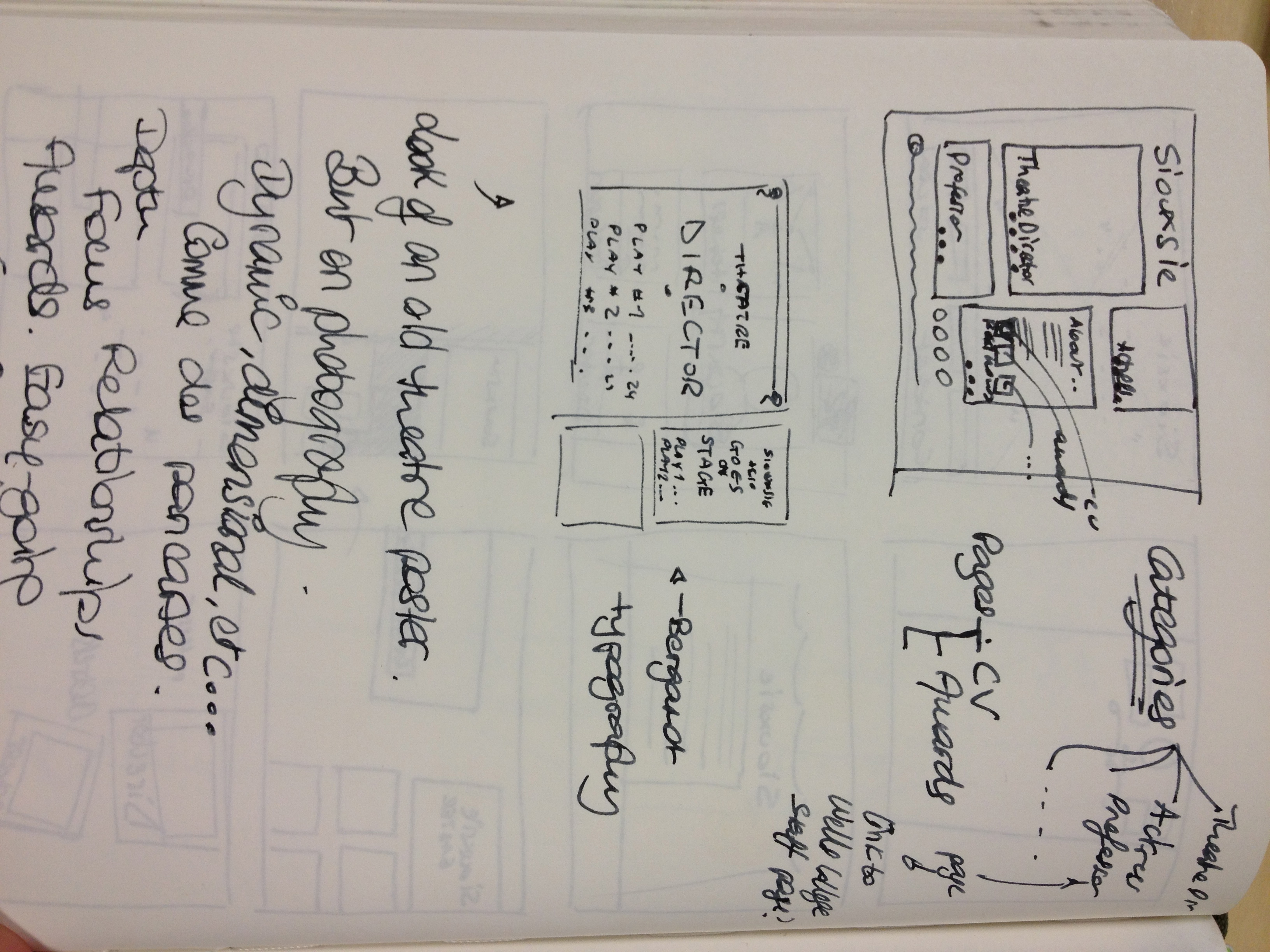
As usual, I was much too eager to get started and began playing around with her name (very distinctive) and some layouts. I doubt any of these will make it anywhere, but whenever I start thinking about a project I simply _need_ to sketch out myriads of alternatives, anything that crosses my mind, just get it down, and eventually I will use them to work from and distil the final design. Here are my sketches.
The next step will involve looking at the competition and determining differentiators.
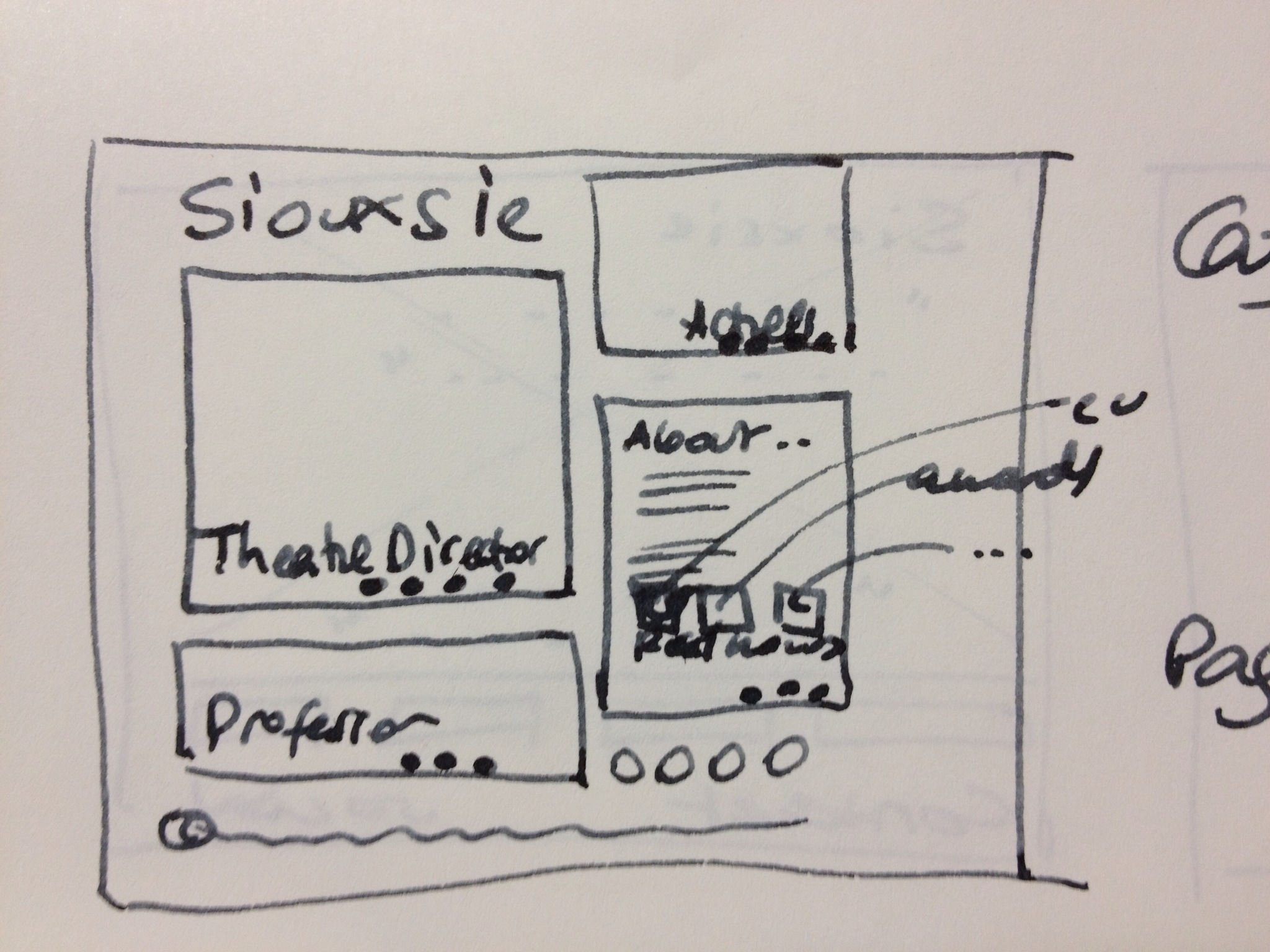
My first idea, classic menu on the left with tabs flowing into and becoming the content when clicked.
..
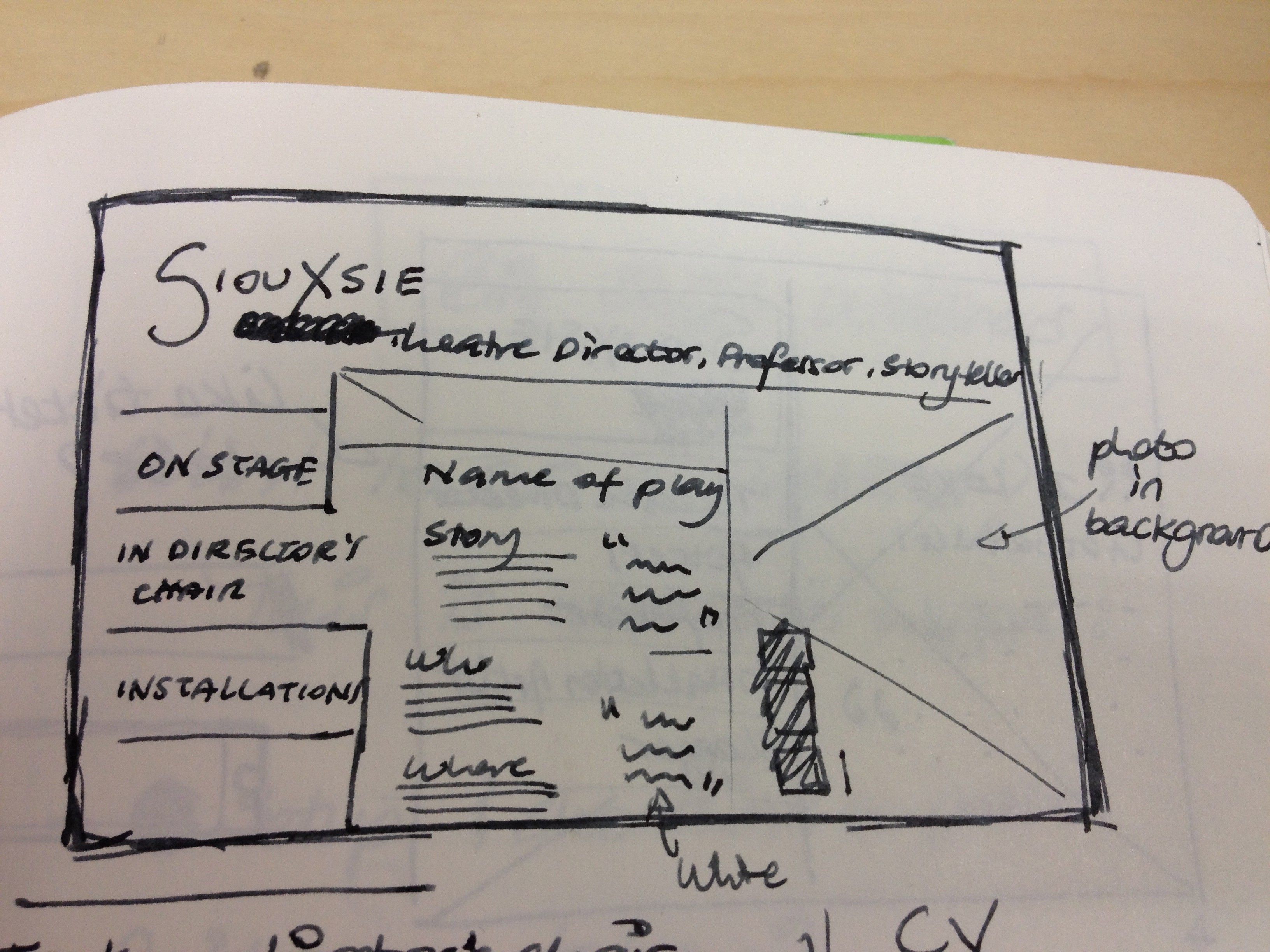
Another idea, moving things around a little. Menu on the right, and feature quote overlaid on the main image. Highly graphical.
..
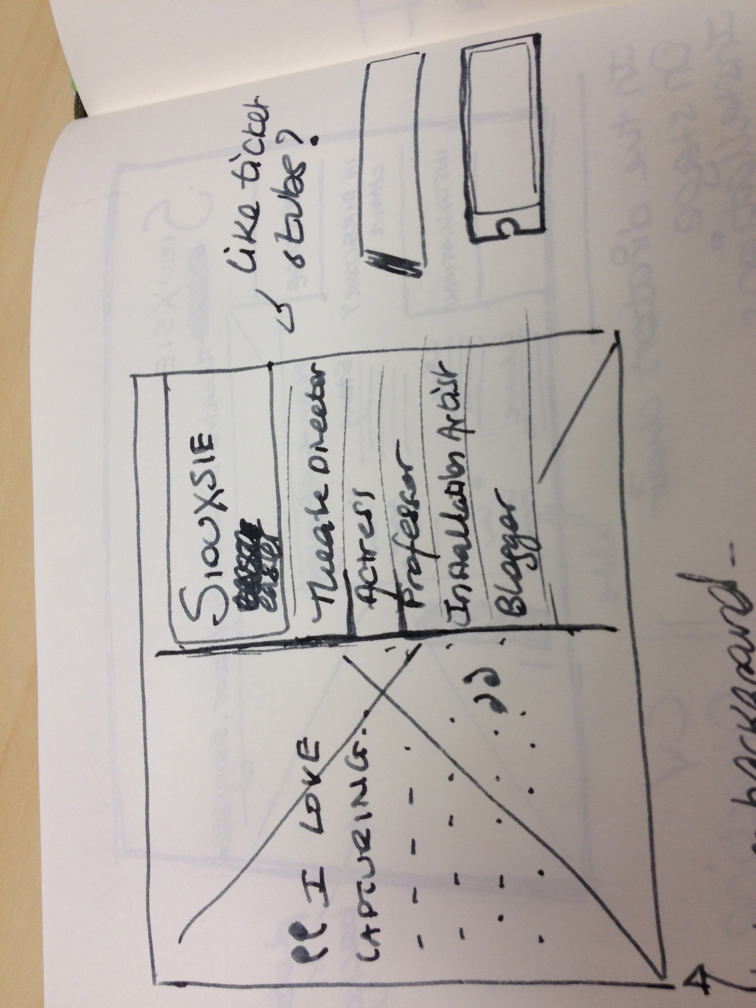
Some more ideas, trying to explore really different layouts. Not sure how I’m doing, but the point is to not alienate oneself to a single design from the beginning. Trying with different alignments, new graphical elements, etc… You can see me exploring relevant keywords at the bottom of the page.
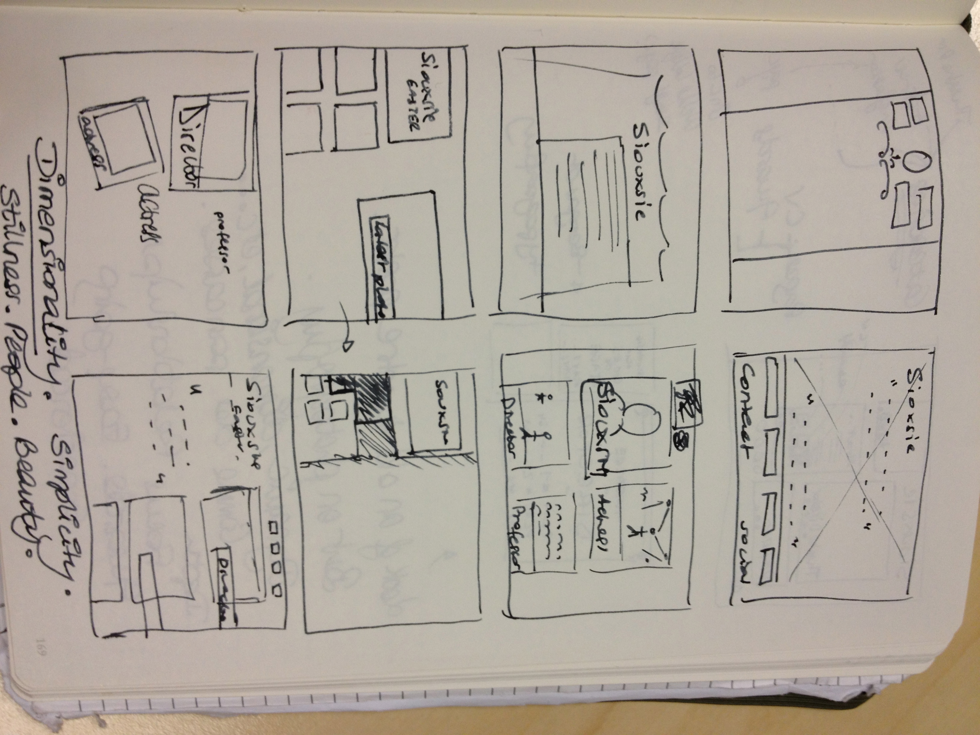
And yet another. I keep going back to boxes. This may feature in the final design. More keywords scribbled at the bottom of the page.
Oh yes!