

Ok, so I didn’t fix it. I just did something slightly OCD only for me. My friend saw what I’d done, loved it, and encouraged me to tell the story and the vision of what FNO could, some day, have.
what is FNO?
A few weeks ago was the much-anticipated Vogue’s Fashion Night Out. The hashtag is #FNO. Shops put out champagne, gifts, canapés, cakes, workshops, manicures, fashion shows, and more. The aim? To attract shoppers, I expect!
I went to the first ever revived Vogue’s fashion night out, in London, in September 2009. Back then, FNO wasn’t online. It was an advert in the printed Vogue. There was no iPad in the world. The iPhone in everyone’s hands was the 3GS.
It was very different this year. You took selfies, tagged and posted them on instagram and twitter, and entered competitions that way.
I’m not sure that worked very well…
Liberty was having a competition, #LibertyScarfSelfie. Take a photo of yourself (or have a friend take one) in front of the Vogue cover in LIberty’s Scarf hall, wearing a Liberty scarf, and you could win… I forget… A gift certificate? Despite having 150k twitter followers, and 149k on instagram, Liberty only got 10 people to take a selfie and post it on instagram / twitter that evening (yes, I was one of them).
That’s a 0.007% pickup on Liberty Customers (if we assume it’s the same 150k on both channels… otherwise that’s 0.0035%).
There was also a website for FNO itself.
I think that more than 200 shops participated, along Regent Street or nearby, and every store had a short profile on that website, telling potential visitors what they were hosting.
the store profiles
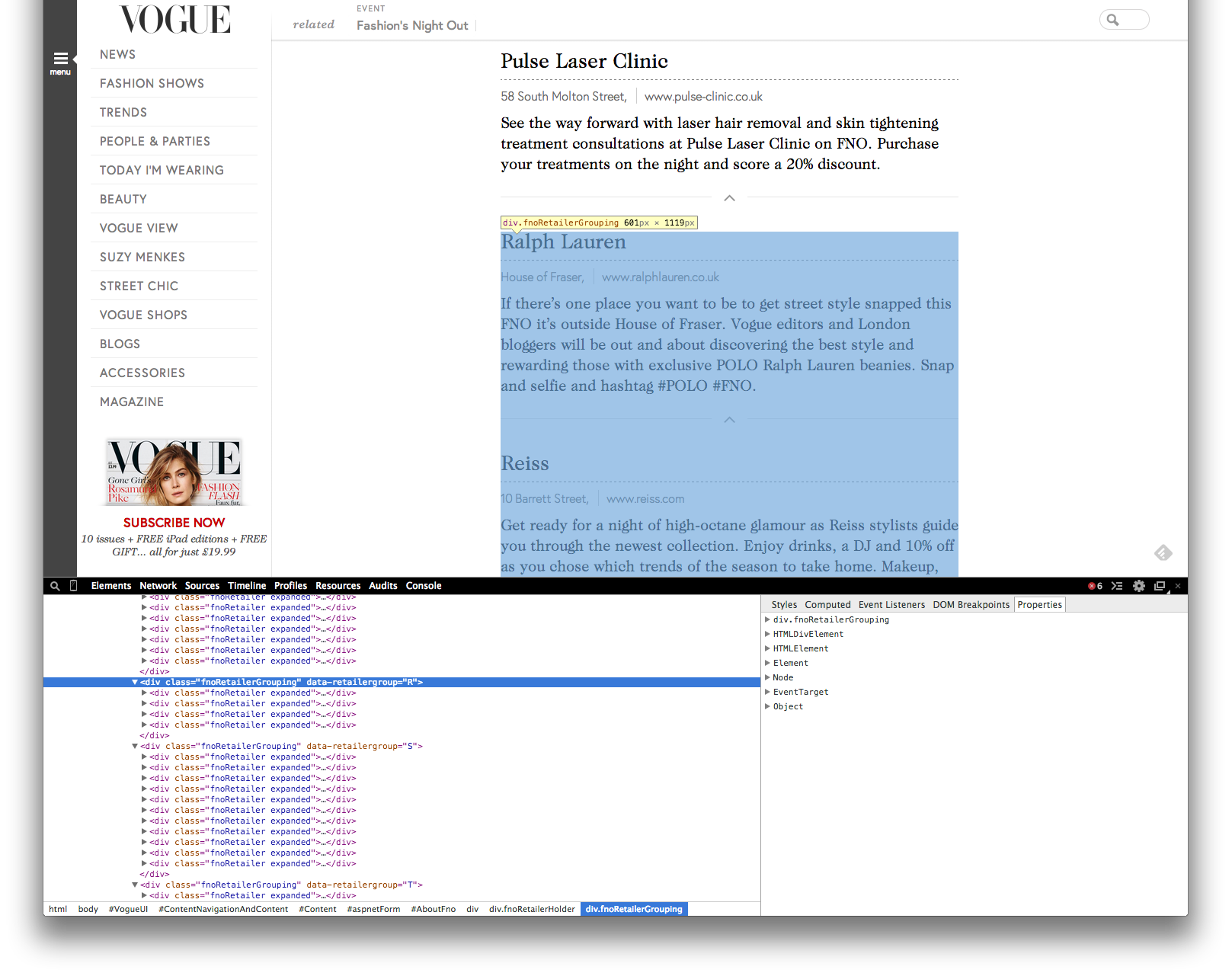
This is what a store profile looked like.
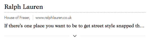
It doesn’t tell you much, does it? You had to click the arrow to expand the section and see the details. If you clicked on their website URL, it took you to the brand website, not a special landing page or anything.
The single line of text each store was granted never showed the entertainment, gifts or discounts offered on the night. The copywriters had placed those further in the copy! Our blasted habit for introduction – main point – other point – conclusion is to blame.
Wouldn’t it have been nice to have the cool stuff appear more consistently, visually, and “above the fold” of each store’s profile?
We could create colour-coded tags: food in orange, discounts in green; like this:
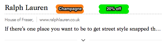
For the record, Ralph. Lauren offered no drinks and no discounts. This is an illustration only. Here is their fully expanded store profile. See how the interesting bits are lower in the description?
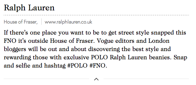
From a copy writing perspective, I would have cut the entire first sentence. The second one is much more exciting, and doesn’t tell me what I want, just what is going on.
the store directory (list of profiles)
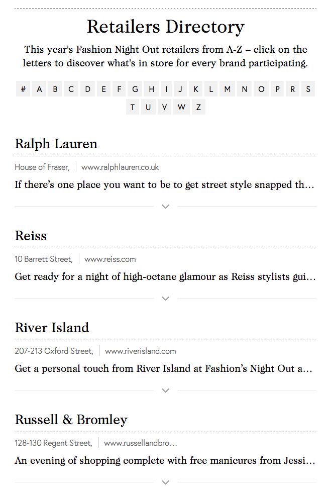
So the profiles were organised. Well. Sort of. There was an alphabetical list, and it only showed you the profiles for your chosen letter of the alphabet. Click a letter, see its profiles.
Here is what“R” looked like.
The first thing I noticed: It doesn’t tell you you’re looking at “R”.
(UX improvement: highlight the letter of the section you’re currently showing!)
goal, step 1: see all details (to choose what is worth visiting)
To do that, I would need to see all that was offered at each store, highlight the stores I wanted to visit, and see where they were on a map to know where I’m going next. Let’s face it, the stores aren’t in alphabetical order on Regent Street.
First thing to do was to see it all. But there was no “see all” option for all the alphabetical sections. I could not see who was participating from all the stores in the area.
So I used firebug to hack the html/css so it would display ALL alphabetical sections. They were on the page, but marked in the CSS as hidden! I edited every single “hidden” to “visible” in firebug. And because that first line gave me zero information, I clicked every store’s arrow to expand the descriptions.
It took me about 15min to do all that! I then saved the massive page as a PDF so I would not lose it. It was about 30 pages of store names and descriptions.
Want a copy of the PDF? Here you go: Fashion’s Night Out 2014 London Retailers.pdf
goal, step 2: choose what is worth visiting
What did I want to do? Well, i wanted to figure out where to go! Based on…
- Which shops are new to FNO?
- Which have good entertainment on?
- A discount for the night?
- A gift with purchase or, better yet, a goodie bag for showing up!
- Were there places to grab something to drink or eat?
The long form text descriptions the brand copywriters had put together for the night told me nothing unless i sat down to read them in full. Nothing stood out. Nothing was highlighted or underlined or anything.
So I read them. I read them all. One by one.
I printed the ginormous PDF on A3, placing 16 PDF pages on each A3 page, so it would be a more manageable format to carry and read. And I sat down, with 3 markers in my hand, and read through each description.
As i read, i used the markers to colour-code any mentions of FOOD & ENTERTAINMENT (yellow), DISCOUNTS (green), or GIFTS (pink).
I then skimmed the massive page one last time, circling the stores I thought were definitely worth rushing to or stopping by (places I constantly shop at, or serious discounts, or giftbags just for dropping by). This is what it looked like when I was done.
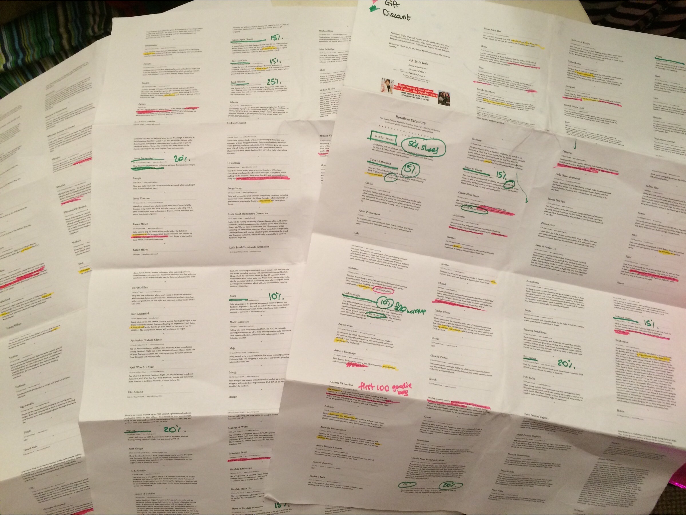
I then had a shortlist of 5 places that were “valuable” to me.
Top of the list was Swarovski, who said they had a gift for visitors. They were my first stop of the night.
Alas their copywriter had made a mistake, and effectively lied on the description: it was not “a gift for visitors”, but “a gift WITH PURCHASE OF £100 OR MORE”. That’s quite a bit of text to get wrong. That one incident shook my confidence in the rest of the documentation.
how to make FNO better
But this post is not about “how not to lie to customers” but “how to make FNO better”. So, in summary, as a customer I would really like an easy way to:
- see WHERE everything is to get a feel of the scope of the enterprise (e.g. are there more stores at Oxford street end, or Piccadilly end?) -> try a map with pins
- see WHAT is on offer (food, discount, gift, special guest / entertainment, presentation, ….) – ALL of what is on offer, with quick visual recognition of the various types. (e.g. where are all the gifts?) -> try colour-coded tags for each type of offer. Remember to add them to the map pins.
- select the ones that are VALUABLE to ME (e.g. Who is offering things I would love and use anyway? – I would love to own nearly everything at Liberty, whereas you couldn’t pay me enough to walk around in anything by Timberland) -> try a “favourites” feature, if a user creates an account or logs in via social. Add a “must visit” higher level of priority.
- plot a ROUTE through the ones I care about, with prioritisation. Gifts have precedence over discounts, because gifts can run out of stock. (e.g. where should we start/meet? Where should we go first?) -> travelling salesman algorithm on the mapped pins, starting from where the most “must visit” pins are.
I think what surprised me the most is that plenty of visitors on the night seemed to be decently informed about what was on offer.
And I would have to wonder: how many know web development and can hack the html/css like I did to see the full list and easily read it? Or did they sit at their computers tapping through and making manual notes for a couple of hours?
Did the brands advertise the event themselves to their own loyal customers? Liberty certainly did to me (then again, they invade my inbox every single day with some exciting news).
But then what is the point of having the FNO website? You cannot save, read, list, plot… I couldn’t see the true usefulness of it. And when I find something is not useful, I get rid of it. If the FNO website is here to stay, and I think it should, then it is time it became more useful, and started delighting its users with interesting and useful things to do.