

When people ask me what I do, I reply that I make websites. If I confirm they know a little about the software development world, I may ask them if they’ve heard of User Experience. I tend to leave it at that if they nod, or give an example of what good UX looks like. For example, the iOS7 addition (better 5 years late than never) of the mini control panel for toggling wifi, bluetooth, torch, and other need-it-quick features.
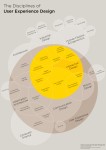
As my friend Robert Fransgaard recently blogged though, I don’t dare go further. UX means something different for everyone, and it’s often not worth the hassle trying to find out what. Every time a recruiter calls me, there is a new title for what I do. At some point I might convert FastCo Design’s diagram into a heatmap of what I do, and carry it around in my notebook. Yeah, no…
Why am I writing this?
I just spent 6 weeks working as a freelancer doing UX. I’ve been at an advertising agency recommending improvements to a section of an investment fund’s site. I’ve worked on redefining, from scratch, a big transport player’s travel agent incentives website. I implemented a minor change on an accountant’s website which saw traffic start to come in through organic searches. And I am now redesigning critical conversion pages for a startup venture’s website.
Swanky. But. What did I really do?

1 – no (such thing as) dumb questions
I spent a huge part of my time asking questions and listening to people. I asked the dumbest, silliest, most out-there questions. And it was acceptable, because – and I joked about this often – I’d known the project less than 48 hrs. The answers were interesting. Perspectives changed. New scenarios and needs were uncovered, or old ones were deemed unnecessary and sailed off into the sunset (there’s a software pun there) for good. In short, I took my sweet time to understand what the site I was building a) was capable of, b) why that was important to its users, and c) what did the owner want to accomplish.
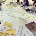
2 – doodle time!
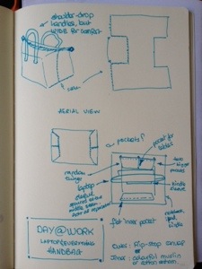
After the questions, came doodles. You read that right. Doodles. Mind maps. Word clouds. Sketches. Lists. Often, post its, to help reorganise the entire site or section. That bit is IA (information architecture), I’ll leave that aside for now. Basically words and lines, trying to corner the problem and suggest a solution which I could show everyone and see if I’d understood things correctly. This is messy, full of necessary dead ends, mistakes, and takes anywhere between one and five full working days. I’d like to say no trees were harmed, but the A3 supply ran thin and many pages from my notebook were sacrificed.
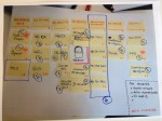
3 – clean wireframes to share
What’s after doodles? What every UX-related job is full of: WIREFRAMES. Wireframes mean different things to different people, so I’ll clarify. They are big boxes laid out on a page, with -maybe- a list of the items that go in them. As work progresses, wireframes will increase not in pixel-perfect fidelity, but in clarification of content and relative sizes and positions / groupings. In the gmail interface, you’d start by seeing 4 boxes (nav, “folders”, messages, adverts) to a detailed listing of the inbox table headers and row controls. For this step, because I’ll want to share a PDF of it, I prefer to use Balsamiq, and heavily annotate my work.
4 – mockup? prototype? often just a matter of links
After the wireframe – when necessary – come the mockups & prototype, which I usually build with Fireworks. Anything from Axure, to Illustrator or Photoshop can be used for it just as well. To start with it’s just a mockup, a single screen, or several screens, with the details one wants to show. Pixel perfect. This is when I play with typography, colours, and other visual aspects. Depending on the complexity of the interactions and journey, I may hook these up so they can be demonstrated in an interactive way using html or by exporting them as a linked PDF.
5 – video’s worth 10 pages a lot of text
If there is more time and we need the visual clarity of what I call (some colleagues may remember this) a “full monty” prototype, I build one. It will look exactly like the finished application, and be able to demonstrate all the functionality, if you follow the correct click-paths. I do not build these very often. For client demo purposes, I’ll choose one story, one use case, and create a “full monty” that demonstrates that one piece in all its glory (so really, not a _full_ monty at all!). It’s a very powerful thing to show. Using a “full monty” prototype, it’s also really easy to record a demo of each feature in a separate video, which can be shared with clients, development teams, test teams, and so on.
6 – if I can’t do it, how can they?
Lastly, before implementation, is the proof-of-concept. This is a basic html / css file that I will code up, after I’ve created my image resources for the page by slicing the mockup/prototype, to make sure that what I am proposing works. Usually I do this only for simpler projects, as my coding speed is, for most projects’ requirements, much slower than my design speed. Once I’m sure it will work, I can copy the useful pieces from the POC source, and move them to the deployment site. Job done!
7 – I do it too, but I don’t talk about it
Normally, before all this, I’d need to define use cases (e.g. send an email) and write UI-agnostic usage scenarios (e.g. trigger composition, choose recipient, enter subject, enter text, trigger sending). These would fit in the user journey that will be experienced on the site. But in recent work there has been no time for that. Not officially. I never really skip it. Every user has a goal (or many), and my job is to help them get to it. That’s a use case (goal), scenario (example) and journey (workflow). They’re critical. Just because I don’t talk about them, doesn’t mean I don’t do them.
and I love it all
My favourite part? All of it. Absolutely all of it. I love understanding something new, how people will use it, creating a mental model for them, and ironing out the details of every tiny piece of the interface. It’s almost like falling in love every time. An addiction, to finding the best control, the best wording, and creating the easiest path possible for the user.
hi, I’m Sophie, and I’m addicted to UX.
When I’m not thinking about website layouts, I think about kitchen countertop organisation, handbag architecture or phone cover usage scenarios. You’ll wish I were kidding. It’s just how my brain works: how we interact with our environments (and how to optimise such environments to our needs) absolutely fascinates me.
Love the passion Sophie. Great post.
Thanks Paul! It’s an addictive job… :)