
This is a page out of a series of specs I wrote for a particular set of websites that use RWD (Responsive Web Design). It was created for the CMS authors and for the devs.
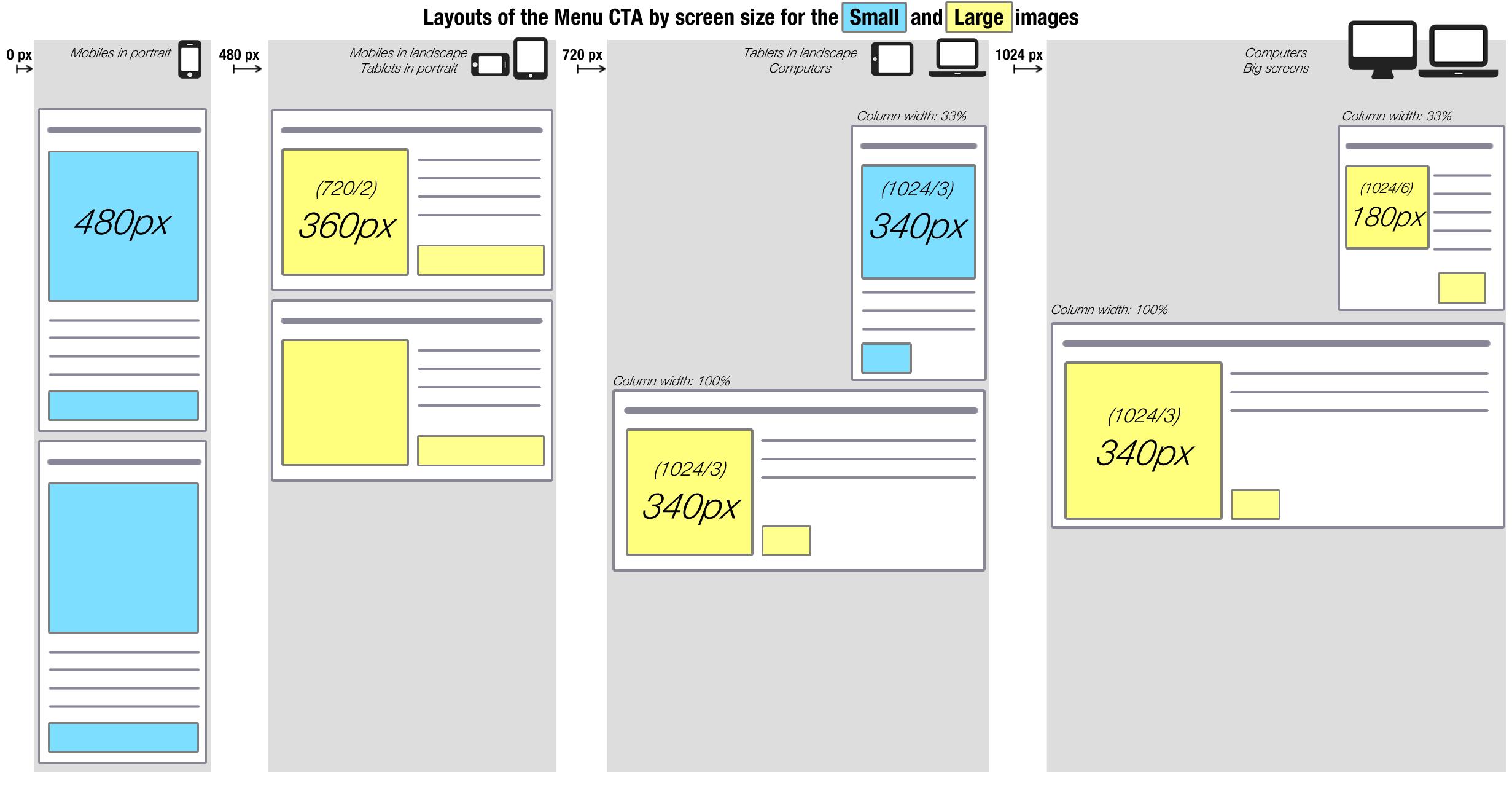
It illustrates the behaviour of the title-text-image-moreButton block on various screen sizes, after it was built on a CMS with various constraints.
To add to the complication, on the larger screen sizes, we had designed a sidebar (width: 33%).
The CMS had two image sizes labeled by default: small and large. The dev team kept the names. We used the “large” images (in yellow) on the larger screens and the “small” images on the smaller screens (in blue), even though “small” and “large” were not related to the size of the image when it’s being displayed.
This confused me, and was likely to confuse anyone setting it up, so I used some colour-coding in this document to help whoever had to configure these blocks deal with this labeling. Yes, I considered changing the names to “mobile” and “desktop”, but that wasn’t quite right either. (cf. what’s happening in the sidebar in the 3rd column, which is definitely not on mobile)

In defining all of this, I found the “download as CSV function” of http://viewportsizes.com incredibly useful. You’ll find it in the footer of their homepage.