I’m tired of my current business cards, because they have nothing to do with business.
I have had moo minicards for a good 3 or 4 years.
On them, i share my mobile numbers in the UK and Greece (i don’t fancy printing two versions), website URL, twitter handle, email, and my name.
Nothing about what i do professsionally, nothing very memorable aside from using a photo of something i have made (dress, painting, sketch) on the back.
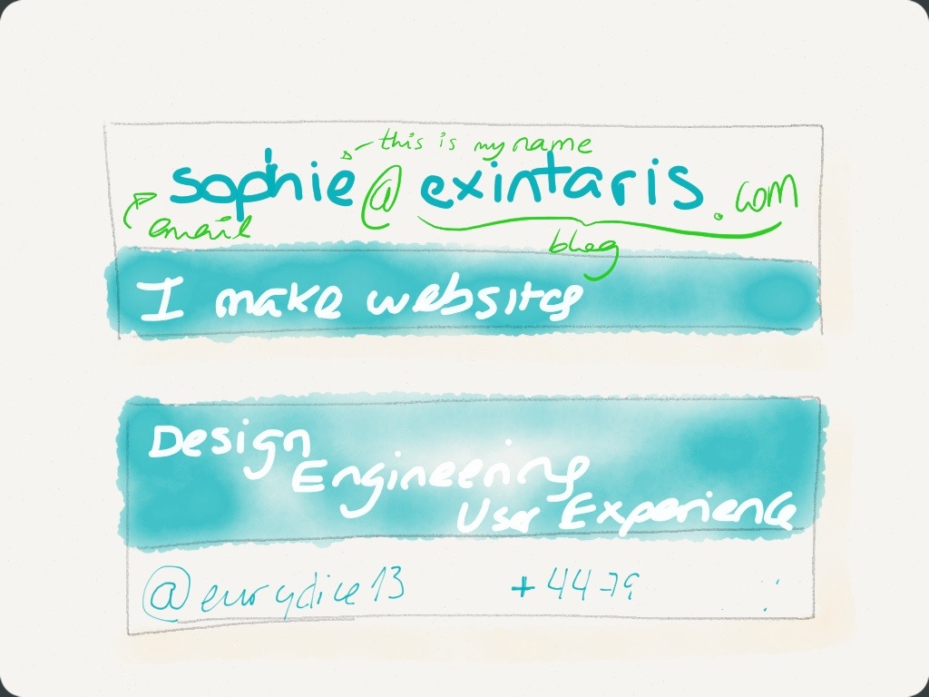
For a long time, i have been thinking that i would really like to have some cards with less personal information, and more about what i do. So here is a sketch.
The colour used is a close approximation (in the paper app by 53) of my “signature colour”, a dark blue-ish turquoise, which i also use on my website. In the real card the colour would be flat, not wishy-washy.
I have toyed with the idea of using my email to show both my name and blog URL. Wonder if that works.
Then used a separate spot for contact details like phone or twitter. In part because that is what i expect people to use most.
The back of the card sort of mentions what i do.
Of course the what i do part is slightly in flux at the minute and i think the website is going to require a spot of redesigning with a focus on storytelling. But i have some sketches for that. I’ll share them soon, promise!
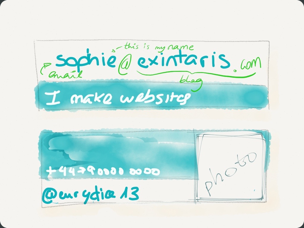
The only thing missing is a reference to things I make or photographs I take. I may have to incorporate that somehow. Maybe like this. The image would be tiny though. I’m not convinced.
I have never felt the need for a logo, as I rather enjoy being myself. I do not need a company to hide behind. So i am choosing to use a signature colour instead as my personal brand. Luckily, I am not aware of anyone using the colour for anything. I hope it stays that way, because I love it.
Thoughts? Opinions? Preferences?
Is the name/email/url combo confusing for you?
Would the photograph be pointless if it’s so small?
I’d love to know what you all think.


You could have a subtle difference between the sophie and the @exintaris.com parts or even different colours if you want more distinction.
Rather than some random photo you’ve taken, doesn’t it make more sense to have a photo of you, pointing a camera at your potential client? It reminds them who you are (of the time you met them), and suggests you can use a camera. The business card is to sell you…
Interesting idea for the camera self-portrait. Me vs. my creations. Amusingly enough, that was the first kind of photo of me the internet ever saw (http://exintaris.com/2013/06/do-i-really-need-a-photo-for-linked-in).
But then I get to the part of “I make websites / wireframes / publications”… Would you have cards for each aspect? (standard front, varying back)
Depends how targeted you want to be, and how flexible the printing of cards is. I guess with digital printing you can have variations anyway at no extra cost. Might be simpler to just focus on the ‘design’ aspect. Create a bunch of mockups and get feedback… like you’re doing here :)
I’m seriously considering a card that just says,
“Peter Mahoney” (front side)
“Google me” (reverse).
Ha! That would work for me too! Very tempting.
But given we both tend to advise smaller businesses which may not be quite so tech-fluent, there could be clear value for having some old school information on there.
Next time you order cards, maybe make a few spartan ones, as you describe, and gauge reactions?