I was drawing up a UI (surprised?), and somehow started thinking about where I should put the little arrow in my box of text. That caused me to pause, and think. UX Architects overthink… and then blog about it, it’s terrible. But maybe it will be useful some day.
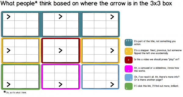
So I concluded that the little arrow means one of six different things depending on which position (of the 9) it has on a 3×3 grid.
For those who find the image too small to read:
1. (teal) It’s part of the title, not something you action.
2. (yellow) It’s a stepper. Next, previous, but someone flipped the left one accidentally.
3. (red) Is this a video we should press “play” on?
4. (pink) Ah, a carousel or a slideshow, i know how this works.
5. (light blue) Ok, I’ve read it all. Ah, there’s more info? Or is there another page?
6. (green) If I click this link, I’ll find out more, brilliant.
The thing that surprised me the most was that when I asked a few friends about this as well (very rough-handed paper prototyping and user testing), they agreed unanimously that any arrow in the middle of a box is “play”. I wonder when that became the standard. Or if anyone has ever put a “play” elsewhere, and found it worked well.
Clearly this is an exercise and not a rule. Feel free to comment with other examples where this grid works (or breaks!).


Hi Sophie, this is really interesting as I agreed with each position. It’s amazing the influence that some products have had on our unconscious minds! Interestngliy I couldn’t feel where the classic YES/NO, CANCEL/OK (or OK/CANCEL for that matter :( ). Iguess on the line between middle and bottom rows on the vertical lines.
Which leaves an interesting thought, what is easier to design for today? Change the established norm or try something *new* like position on the rules of 3rd joins (where the eye is naturally likely to go?)…?
Would be interested in your thoughts as I am only starting to get into UI/UX design.