In my most recent job, we are working in Agile. This is something I am unfamiliar with and am having fun learning about. Possibly too much fun.
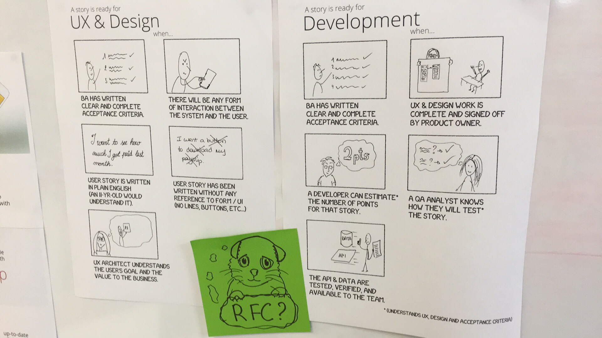
Today, we had people stopping on their way to places just to look at our team’s definitions of “ready”. The chipmunk (I attempted a kitten) asking for comments might be to blame.

People really liked them! I saw smiles, heard giggles, and even a few outright “i love this” positive comments.
Another team’s scrum master liked it so much he’s asked me to have a look at their own definitions and do something similar. (He also suggested I blog this, so this one’s for you, Miles!)
why we have “a story is ready for Development” posters.
A few retrospectives ago, my team unanimously decided to dedicate one day per (two-week) sprint to improving our processes, definitions, libraries, etc… The cleanup & thinking that never gets done? We committed to doing it!
On one of those days, two weeks ago, we talked about what “ready” (for development) means to us. Namely, what is required in a story or around it for it to be included in the next sprint. Everyone working in Agile knows this, but we didn’t feel like we were sticking to it consistently (and personally I am still learning).
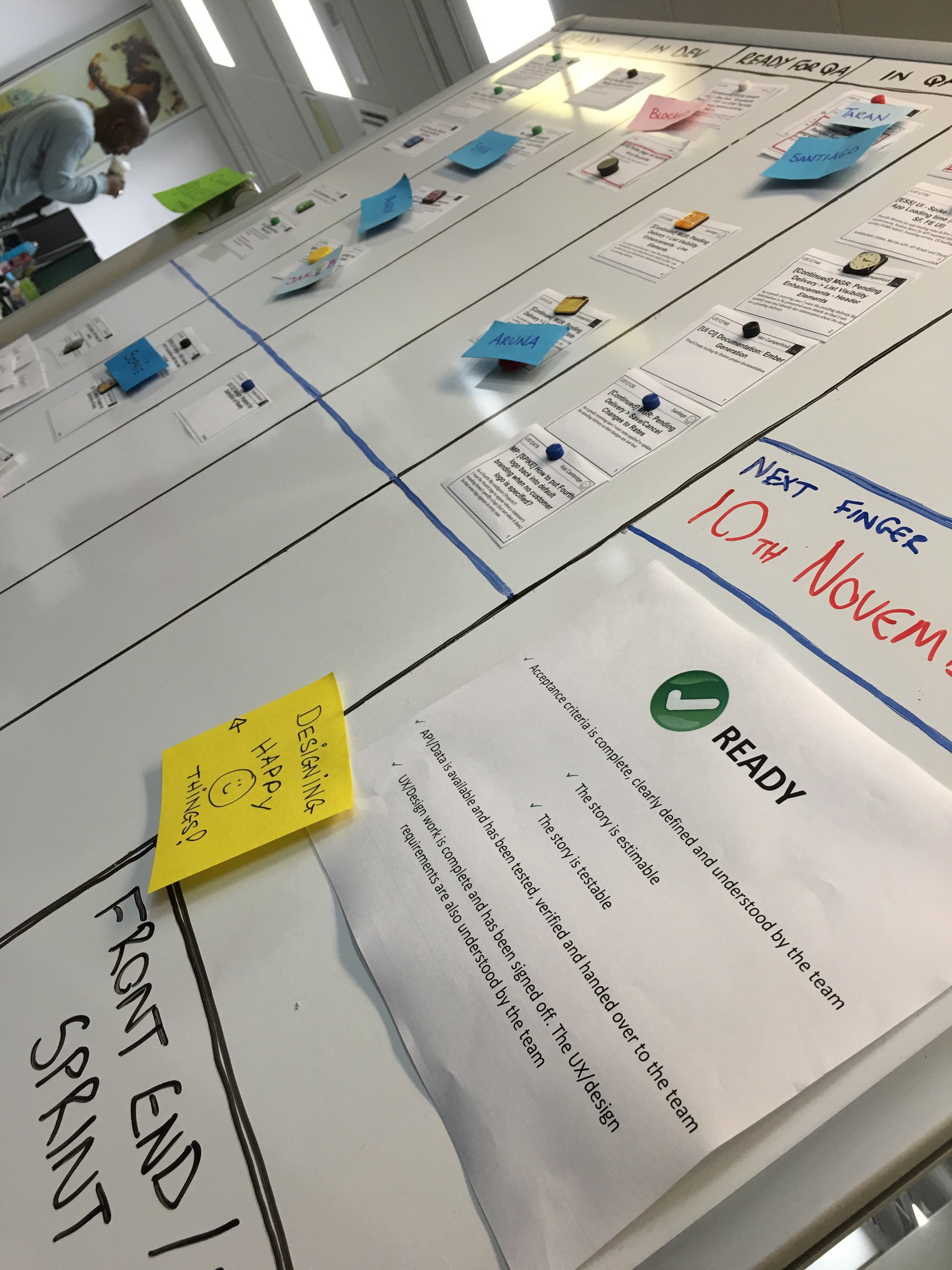
After the meeting, our scrum master wrote up the list of what “ready” means, and put it on our kanban board.
for legibility:
- Acceptance criteria is complete, clearly defined and well understood by the team
- The story is estimable
- The story is testable
- API / Data is available and has been tested, verified, and handed over to the team.
- UX / Design work is complete and has been signed off. The UX / Design requirements are also understood by the team

I figured I should be able to make them a bit more attractive and easier to read from a distance.
it all started as an exercise in typography
I was imagining wordles and the “keep calm and carry on” posters…
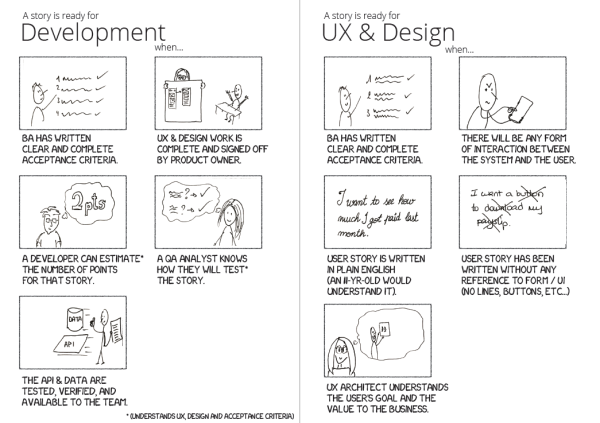
But when I started copying them into illustrator, I found I wanted to express them in terms of people, using the active voice, and describing things that need doing. To me, “A developer can estimate the number of points for the story” is clearer than “the story is estimatable”.
So I re-wrote them, and went back to thinking about fonts and layout, until…
I realised I really really wanted to doodle these people doing these things! I quickly made a page of comic strip frames in illustrator and placed each “ready” statement under a frame. Then I printed the page and drew in my doodles.
To be able to pass this around and preserve my original sketches, I took a photo with my phone (using evernote’s document capture because it fixes contrast nicely on black & white things) and brought it into illustrator via evernote. Then I extracted my sketches and placed them in the frames. With a quick save as PDF, it was ready to distribute!

good things happen when you stick things on walls
The first thing to do was to add it to the RFC (request for comments) repository we maintain on github (another process improvement) and wait for comments from my teammates.
The next day, seeing no comments on github, I printed it, hung it on the back of our kanban board, and also posted a photo of it (with the RFC chipmunk) on slack for the team to see (with a handy link to my pull request *hint hint*).
What happened (instead of RFC comments) is that people started stopping by, commenting on the what they saw on the board and telling me how much they liked it.
So much enthusiasm, and a direct suggestion to blog this, is why I have written this post.
would you like a copy?
Grab the PDF for “it is ready for UX & Design when…” and “it is ready for Development when…”.
I’d love to know what you and your teammates think of it, if you’ll hang it up, put it in a drawer, discuss it, redraw it, colour it in, change the order or the words, or do anything else with it!
Words may change in the future based on feedback, and if they do I will update this post as well.
for font geeks
The font I used is the xkcd font. Randall Munroe’s handwriting! Geek-gasm, right?
xkcd is a brilliant “webcomic about romance, sarcasm, math and language”. I have been following it, and referring people to it (especially as it pertains to passwords) for many many years. If you’re a little bit geeky, you might like it too.
