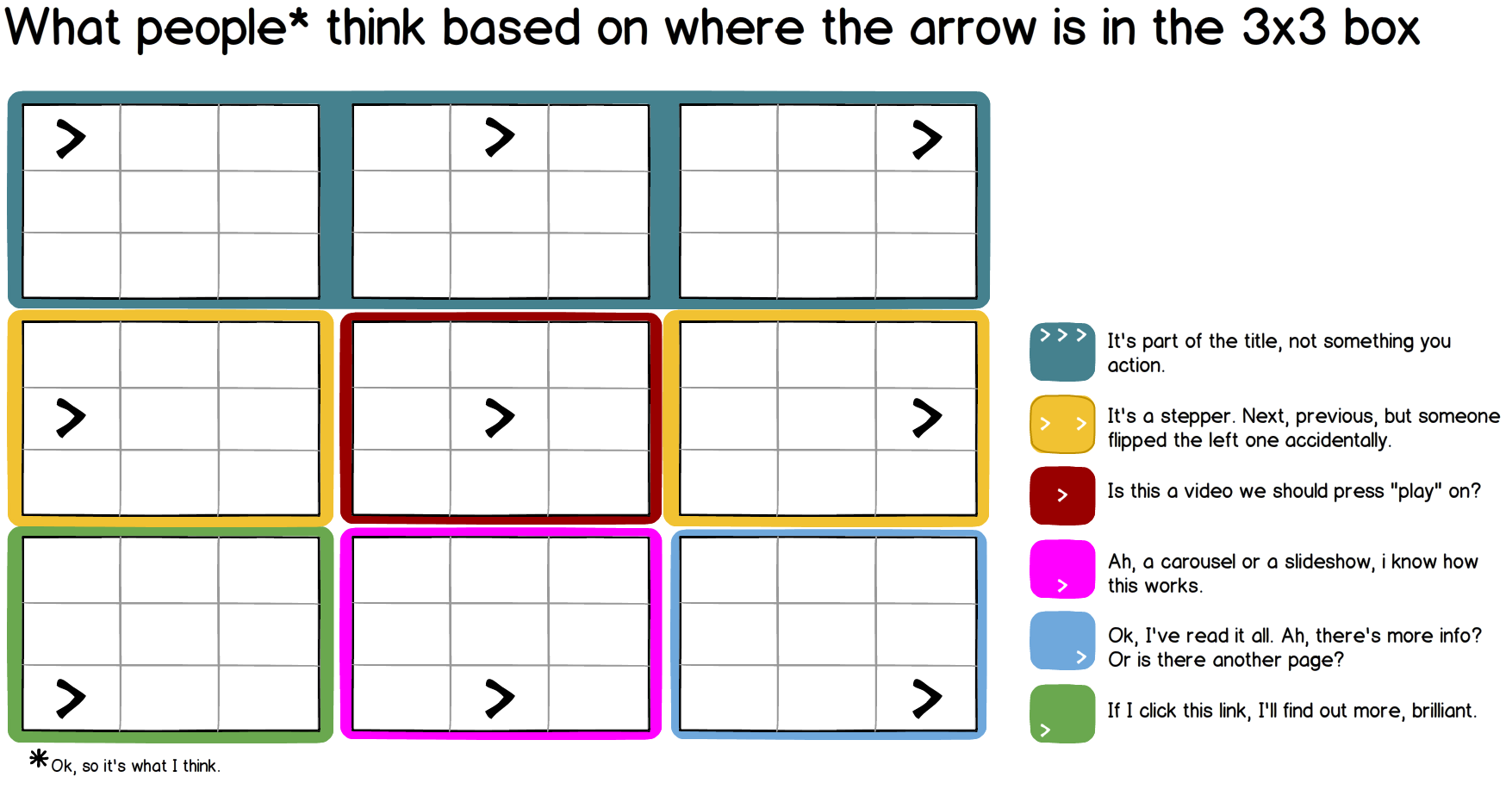
Time to read: 2 minutesI was drawing up a UI (surprised?), and somehow started thinking about where I should put the little arrow in my box of text. That caused me to pause, and think. UX Architects overthink… and then blog about it, it’s terrible. But maybe it will be useful some day. So I concluded that the little […] continue reading »
what the arrow inside your textbox means (on a 3×3 grid)

