Some months ago, I was working at a lovely software development place that specialises in the hospitality industry. Over there, I was part of a development team that worked on a series of mobile-first web-based task-centred apps. And I was the only person who “did” UX…

This is a short-ish story of why I now have a UX process diagram.
The devs worked in agile / scrum. I’d never worked in Agile before (yes, I know, HOW did I avoid this for ten years!??), and I had some trouble adjusting to all the meetings, the planning (where UX never seemed to have stories or things to contribute), and to all the solutionised stories which were written in idiosyncratic BA-speak by people who had forgotten what they were thinking or had left the project.
To top it off, new items to be designed surfaced more than once a week, and priorities were adjusted almost daily. We tried to work with that in scrum, and ended up with a daft-looking backlog, design iterations (all the iterations) that needed to fit into 2 weeks and didn’t, as well as a cache of painkillers to help with the associated headaches.
Three months in, I put my hands up and said “I’m sorry, but this scrum stuff is not working for UX”. I put a short business case forward to our delivery lead “hey Joe, this isn’t working, can we try Kanban because XYZ?”. Joe, being awesome, just said “yes”.
So I quickly sketched out how I would work using Kanban in a “pull” mode. This meant priorities could be adjusted, and nobody had to wait a sprint (or three) for me to deliver other commitments first. Instead of formal commitments for two weeks, we had constant awareness of what was being progressed, and what had been parked.
Our scrum board morphed to include a KANBAN row.

After some research and several sketches, I concluded that:
- I was right, Kanban for design + Scrum for delivery work well together (a few weeks ago I also learnt that this is called “dual-track development”).
- My illustration had to explain, at first glance, the loopiness and explorative playfulness of the UX process. No “powerpoint” style diagrams for moi. To quote a recent book: “PowerPoint never has power and seldom has a point”.
- This would need to be stuck on a wall, on the scrum/kanban board, inserted into presentations (you can’t win them all), and would in all likelihood spread inside the business. So it had to be a very portable format.
- I needed to make something visually attractive, so people would smile at it and ask about it.
- The UX process is pretty much the formal design process, complete with divergent and convergent parts. My diagram needed to show that dynamic.
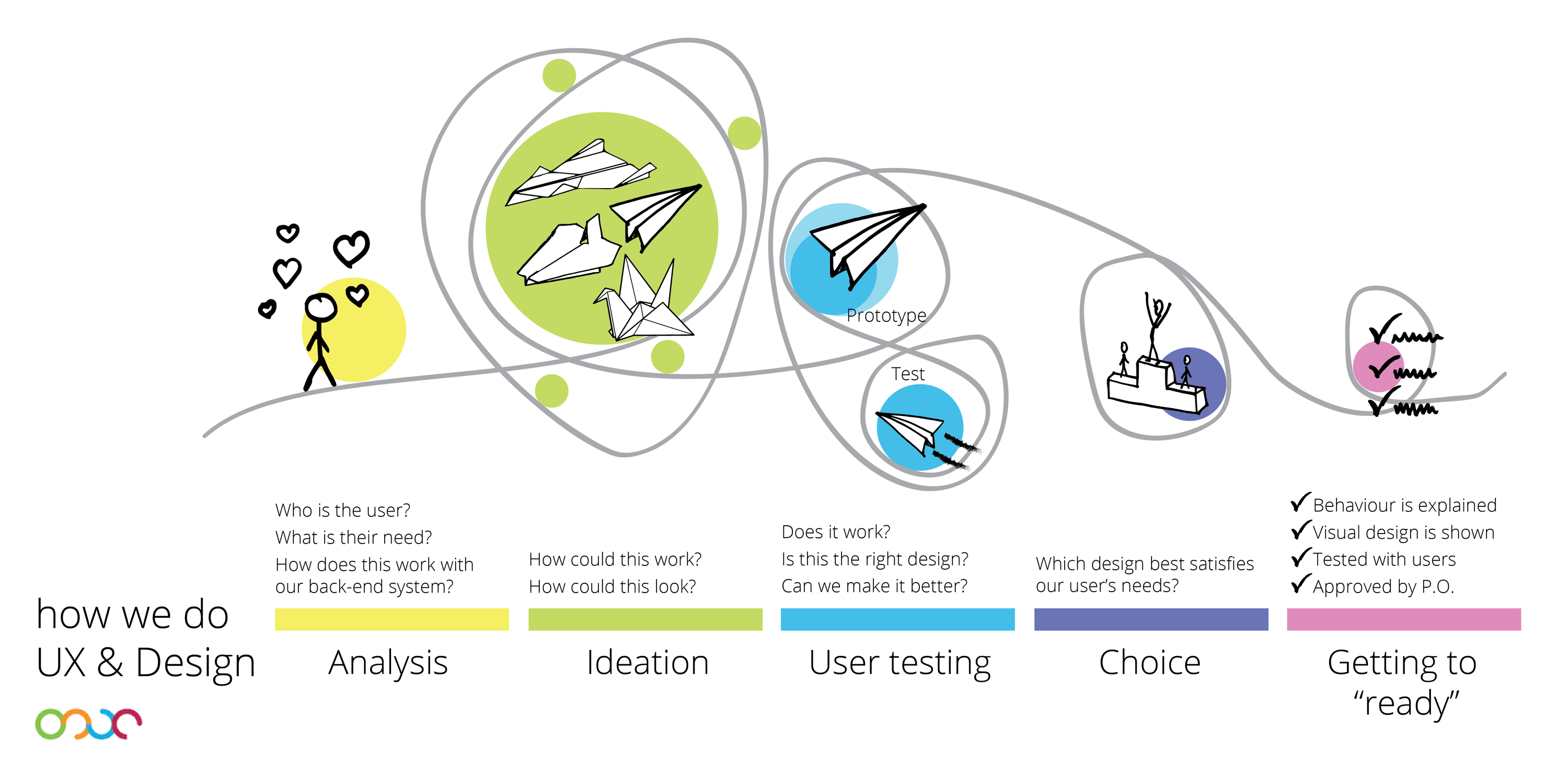
I called my first diagram “The UX Design turnip”, because it looked like a turnip. It wasn’t very pretty, but it illustrated the five phases I had identified, as well as the divergent and convergent aspects of the design phases.
Then I did a few drawings to illustrate each of the phases, ported them into illustrator (evernote pic, drag to desktop, move into illustrator, trace, expand), and made this:
It illustrates how it all begins with caring for your user, then you find new ways of solving a problem, try them out (with users!!) and choose the best one. This best one is then documented to be passed on to development.
The diagram OMITS the best-practice cycle typical of Agile which feeds from development back into Analysis.
What we are meant to deliver is a PRODUCT, and then ITERATE with incremental improvements. If we were to find the final full design in one shot, we would not be working in an Agile way!! So my diagram is slightly incomplete in that it only illustrates one passage through the UX process, rather than how that process also feeds off of development and is, in reality, a continuous flow. Something to add to version 2.0, I think!
It was very well received within the business, posted in several places and walls, and I saw it go into more than one presentation deck. I couldn’t be prouder!!
And now, as a bonus, I am using it at the new job too. (that’ll be the next post)


