
Humans have been developing software with interfaces for “average consumers” (non-IT-geeks) since at least the early 80s. So why is it that more than 3 decades later, I still come across “please contact your administrator” messages? I have no answer to that. But I do have some recommendations and examples of error messages that could inspire you to improve your own.
 Contact the administrator: really? Do you know who administers your network, application or website? I don’t. Whenever I’ve asked to speak to the Dev team or reported a defect with something, i’ve been routed to a call centre where people who can’t understand the problem read from scripts. There is no single administrator anymore. There is no one developer or owner of an issue. It’s a black hole of hot potato, so the “throw it in the air ad see who catches it” method is best. Using a “file a ticket” button routing to a pre-filled form (because the system should know what went wrong) would be a much better way to go.
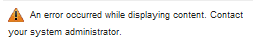
 Error #Hx0038AD937: Because that means so much to humans. If you have to look up windows error codes, it’s gone too far. Just skip straight to “something we can’t tell you about went wrong, want to send us the activity log and error code?”. With a “send” button. Voilà. It’s what Mozilla do. It gives them the info they need and gets out of my way quickly without alienating or annoying me. Simple.
- Try again?: the definition of insanity is repeating the same action and expecting a different outcome. In technology, however, systems often randomly fail and “restart and try again later” is a classic modus operandi. If this is what the user should do, tell them. Google does this unintrusively in gmail, and I think it’s brilliant.
- Do NOT try again!: Conversely, if they should NOT try again, tell them that! Banks and eShops do this when processing payments, with a clear warning that if you do reload, you may be charged twice. Good to know.
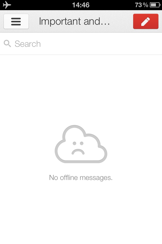
 Nothing for you: if there’s nothing to say, say “nothing”. “Page intentionally left blank” or “no messages today, have a great day!” may seem futile, but they are comforting, because you know that nothing is wrong and “nothing”, is in fact the answer. The iOS gmail app does this and I find it cute.
 Name or key?: When logging into applications and websites, i often wonder whether I’m using the wrong email address, if I should use a username instead, or if I got my password wrong or had accredited myself using a social network identity broker instead. A lot of the time, there’s no way to tell. Some sites, however, are nice and tell you more than “username or password are wrong”. They’ll suggest “enter email” in the field (not username) and tell you “that email address has no password, try a social identity broker”. Buffer does this SO WELL! Really. Paradigm of error messaging, if there could be one. Conversely, e.on energy is terrible, even locking your account for 15min at every attempt past the 3rd. They do not offer any references to try anything else or contact a helpdesk.
 404: page not found: My favourite error message ever, and possibly the most popular pagetype loading on the internet. Less so since Google took over, but still. It happens to me altogether too often. Every website needs a 404 page, and there is a “recipe” for getting it right:
- Apologise, apologise, apologise. 404s shouldn’t happen.
- Make them smile, your user is frustrated, release the tension.
- Be helpful, guide him to similar articles or a search box
- If you can track how they got there or ask them to tell you, do that. Most people will happily let you know what went wrong, as they’d like to help you fix it.
An excellent blog post with 100 funny and unusual 404 pages.
Love it! Passed it on too:
http://peter.webcraft.co/awesome-blog-post-from-eurydice13-7-ways/
Cheers Sophie!