Some random Monday sketches. All drawn today.
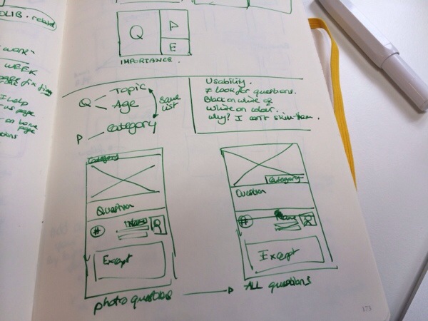
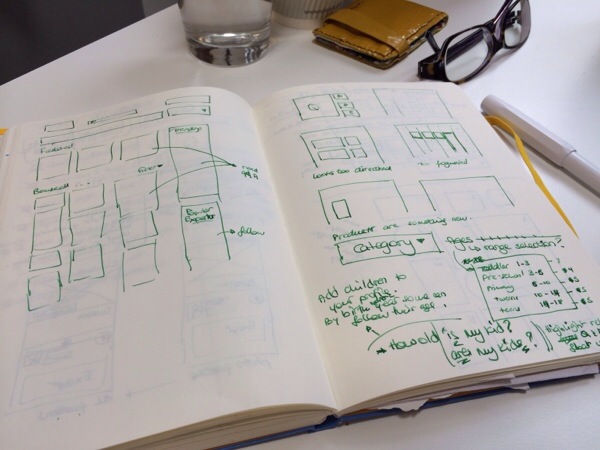
The wireframes are from the structure of a website I’m spending some time thinking about. It talks about children and tech (across games, online security, education, and more) and I have to say I rather like it. quib.ly: for techie parents. (this is my tagline, not theirs)
They are organised around questions, which both the community and experts answer. And I found a bit of confusion in the visual representation of the questions. So I started sketching how else they could be laid out. This is a close up of the before & after, where the category would be nearer the question (for instance).

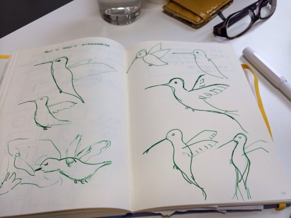
Another site I’m working on (my main official project) is undergoing a major aesthetic overhaul. As part of that, we’re looking at logos. I chose the new colours (predictably variants of blue and green, everyone likes those!), and the owner suggested we use a hummingbird. It’s cute, it’s busy, it’s efficient, and those are features related to the site. Here are some sketches I made based on photos I found online.

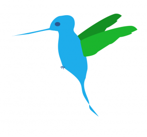
And then I drew it in fireworks. This is the mascot part of the logo. I’d share the full site, or the full logo if I could, but neither are ready yet. Do bear in mind that the actual hummingbird will be a lot smaller on the site.


