Despite being an Engineer (or perhaps because of it) I am prone to reinventing the wheel.
This is a post about how I reinvented the calendar, for the purposes of planning ahead, and doing it better.
I am unsatisfied with calendars. Base 7 doesn’t come as naturally as base 10. And cutting things up in months (for no other reason than the moon orbiting the earth) seems… cosmetic. (pun intended)
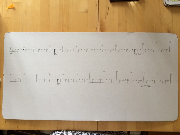
So I designed a linear calendar with 5-day markers to easily count days on our fingers. You’ll notice that it’s horizontal, so all time is created equal and flows left-to-right, just like we write.
the design
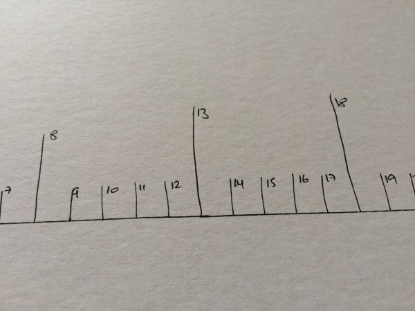
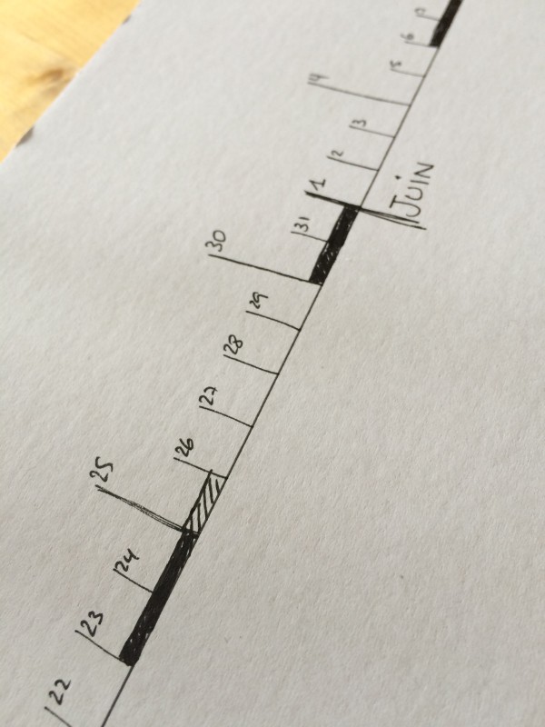
Clearly, I needed to see every day. So I used a ruler and each day was marked at 1cm. I’m a metric kid. Every five days, a taller line was placed, to make it easier to see how many blocks of 5 days have passed.
Then I needed to see when the months broke up. The slightly chubbier lines escaping downwards mark the first day of a month. Août is August in French. I do a lot of my writing / counting / datestamping in French. I strongly suspect it’s because I went to french school.
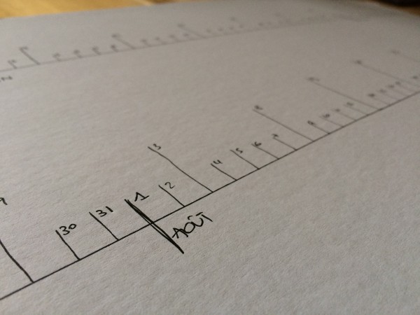
Workers need to see weekends, so I devised a method for marking them out (black boxes). Along the way, there were Bank Holidays. Those got a hatched box. In this next photo, the second May Bank Holiday.
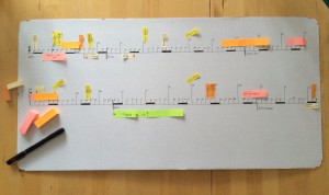
This is what my calendar looked like once it was fully annotated and ready for use.
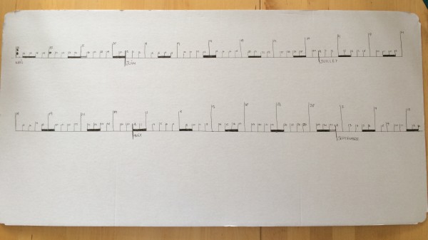
I could have drawn a third line, but I only wanted to map out my summer, so I stopped in early September.
the scenario
This summer, with my partner, we had several things to fit in.
Some were beyond our control and immovable: The Man’s brother was visiting, three sets of friends were getting married, and The Man is usually indispensable at work near the end of the month.
Others needed to be fitted in around the immovable ones: seeing my family in Greece, a week on a beach with my best friend, and a two-week beach holiday with The Man. It looked like a complicated undertaking… until I made this calendar! It made things to easy to see and understand, that I wanted to share the design with everyone.
the materials

muji make tiny little post-its that happen to be precisely 1cm wide. Tesco also make post-it stripes which happen to be 5cm long. We used these to annotate all the days and weeks with events.
The immovable things were marked out in orange. Some important ones (not to be ignored, but which could be missed with some management) were in yellow. We used cream for the unimportant items that were in our calendars but that we could miss.
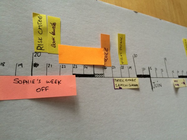
After all the small things were in place, we created strips of the longer post-its for the holidays we wanted to take (e.g. 10-15 days on a beach, followed by a city break) so we could try placing them. The available slots were immediately obvious. So that’s where the holidays went!
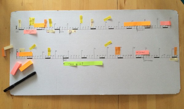
If you would like to try planning the next few months using this linear calendar, you can download this PDF file! It prints over three pages of A4, which you will have to line up next to each other.
 Download the linear calendar PDF (September 2015 – April 2016).
As a bonus, if you really have the space and want to go a bit nuts, you can always cut the three sheets into strips, and stick up one long timeline. But I find that it’s nicer when you can glance at time and it all fits within your field of vision. It’s part of why I chose three pages as my limit. Put them on your desk, stand up, and see it for yourself. ;)


4 thoughts on “linear calendar for better planning (with post its)”