Last week, my partner and I took a long overdue holiday. The destination? Salzburg and Munich. Both are in Bavaria, while being in Austria and Germany respectively. Part of travelling is discovery, and this time I was delighted to find good UX everywhere around me. Here are some examples.
Street crossings tick and have Braille
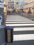
Unlike London, Paris, Athens, Rome, or Brussels (the European capitals I’m most familiar with), the little town of Salzburg in Bavaria has incredibly smart street crossings. And by smart I mean that they tell you, constantly, whether you can cross the street. No. Not with a red light. Well yes, that too.
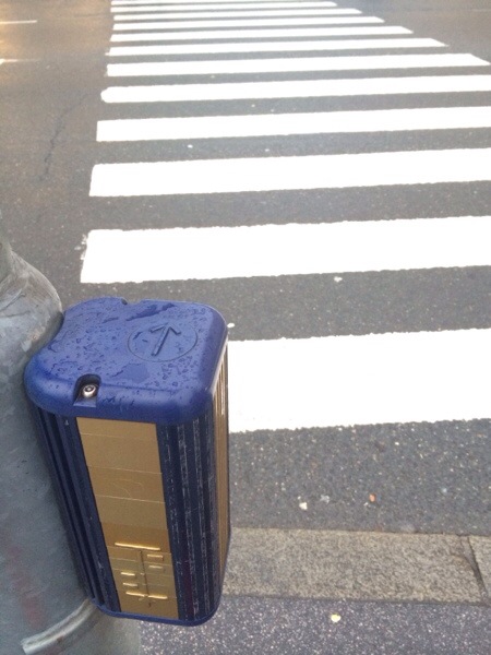
The little man is definitely red and standing still. But the ticking sound coming from the box next to you, which has a nice arrow in relief on top indicating the direction of the crossing (and another relief for how many traffic lanes you have!!! Amazing!!!), is slow when it’s red, fast when it’s green. This. Is. Genius.
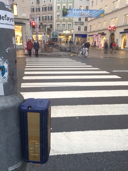
I am frequently surprised and feel practically physically assaulted by the discourteous, disruptive strident beeping we have in London for when it’s ok to cross the street. I’m all for that. I do not fancy blind people becoming roadkill, heaven forbid! Turns out, however, there is a much more discreet and improved solution, with constant feedback on the status of the system. Something which the screeching beeping crossings fail to do.
Carriage map at station
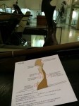
We were about to get on the train to Munich, and we knew the carriage we were on as well as our seats… and there were signs on the platform saying “2 coach train” and “3 coach train”, or some equivalent. A bit like in Woking, Surrey, where South West Trains say roundabouts of how far along the platform would a train with 3 coaches stop (or 6, or 10…). This was helpful, but then I saw this!
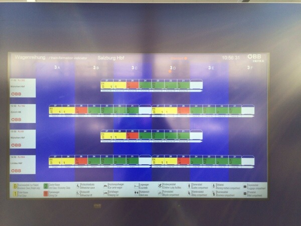
There is a smartly designed proper map, on a digital screen, showing me the next train coming up, its destination, and precisely where on the platform each carriage is going to stop!! So completely unexpected and delightful I had to literally run back to the sign to snap a photo as the train was pulling into the station.
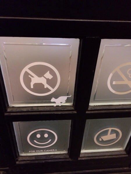
Humour in museum signage
No words necessary, I think!
Metro destinations and times (overlap of lines)
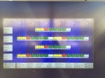
In Munich, a bit like in London, some tube lines overlap in their paths. Except that in London you don’t have FIVE lines overlapping at any one time. In Munich you do. Bavarians seem to like optimisation (my kind of people, clearly), as they only have one N-S platform and one E-W platform per station, as far as I could tell. Platform transit times are minimal, but this also means that from a single platform you could head out towards five different places!
I’m feeling exceedingly silly for not having snapped a picture of the lovely announcement board which showed:
- the destination of the next 3 trains
- colour coded with the colour of the line on the map
- including the number of the line (lines have numbers, like in Paris, not names like in London)
- in how many minutes each would show up
- how many coaches each has
Would I say that you have to visit Bavaria if you love UX? Umm… that’d be silly. You should visit Bavaria in the summer so you can take advantage of the thousands of Bier Gartens everywhere! If along the way you are delighted by good UX, drop me a line, and a photo!








Really enjoyed this one!
:D Thanks!