Time to read: 5 minutesThe most underestimated, underused, and unknown element of Human-Centred Design that I have ever encountered is the Question. That sentence that pitches up at the end, and finishes with a beautiful and quirky uncertain squiggle with a supportive dot underneath. When we are five, we tend to be great at questions. We ask the Queen […] continue reading »
Tag: design
Yet another lifehack for health
Time to read: 3 minutesI’ve not been well. Nothing major, just anaemia, and perimenopause, but it does impact life deeply when every morning you wake up from a solid 9 hours and feel as energised as if you’d barely slept. Do you take vitamins? One of the things I have been doing for years is taking health supplements. Mainly […] continue reading »
The mental health forest
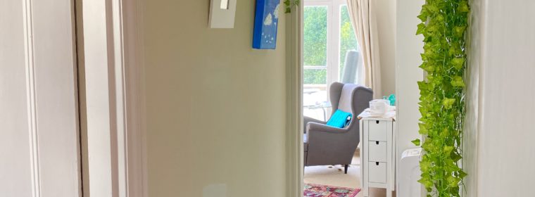
Time to read: 7 minutesThe forest I built a little forest. Or so I call it. My corridor has a bend. It makes a right angle to the right, that you can’t see from the entrance. So in that part of the hidden corridor, a part I only transit through – like all corridors – I hid a forest. […] continue reading »
8 UX “must reads” (the books)
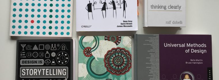
Time to read: 7 minutesI’m often asked about what I use as a design reference. And as the question has been coming up more and more often, I thought it’d be good to try and write up an answer. This answer will be in multiple parts. In the first part, I listed a few NN Group articles that act […] continue reading »
Don’t panic, this is an agile experiment!
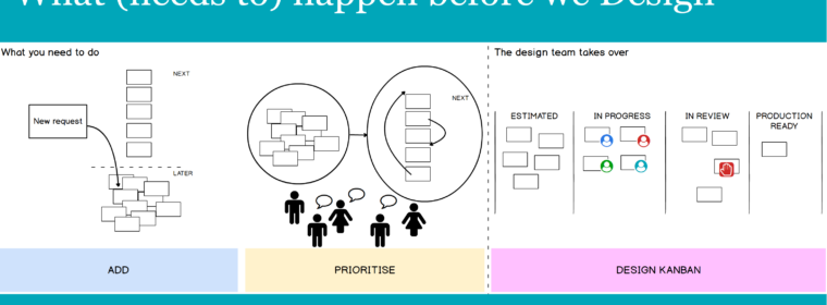
Time to read: < 1 minuteAfter many months of requests from multiple product owners who never talk to each other (and I am including marketing in that group), we (the design team with me as Head of UX / sole UX person) are finally beginning an experiment with the blessing of our Head of Product! As of this Friday, all […] continue reading »
Iterations of icon classification
Time to read: < 1 minuteIterations of the classification and combination of icons on our news items. #iterativeDesign #designProcess #informationArchitecture #devilsInTheDetails #UXlife #UX #e13 made with @balsamiqmockups of course! via Instagram http://ift.tt/2ul1qxb […] continue reading »
Sketchbook Mondays: Cup sleeve and card holder
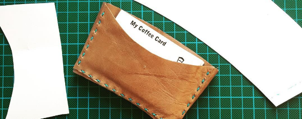
Time to read: 2 minutesOne of the problems I’ve always had is that I my hands are hyper-sensitive to heat. In itself this is small, but in 2017, I decided to stop having milky coffees. I’ve never digested milk very well, and it was time to stop it again. So it would be mostly americanos for me in 2017! […] continue reading »
Should developers think for themselves?
Time to read: 3 minutesI just had a weird conversation with a colleague in our standup meeting. We have a new developer who joined recently and is specialised in working on a particular platform. My colleague argues that if we send the dev my UX wireframes for the improvements, which are made in the sketchy style of balsamiq, he […] continue reading »
documenting responsive web design for CMS authors
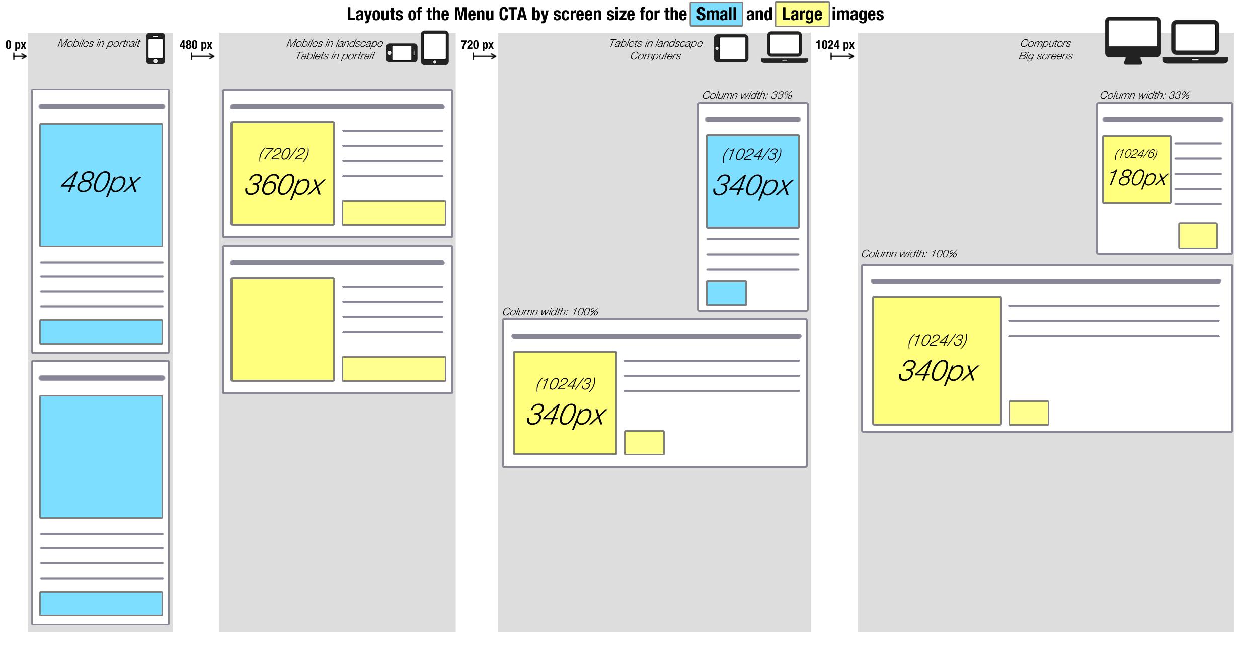
Time to read: < 1 minuteThis is a page out of a series of specs I wrote for a particular set of websites that use RWD (Responsive Web Design). It was created for the CMS authors and for the devs. It illustrates the behaviour of the title-text-image-moreButton block on various screen sizes, after it was built on a CMS with […] continue reading »
linear calendar for better planning (with post its)
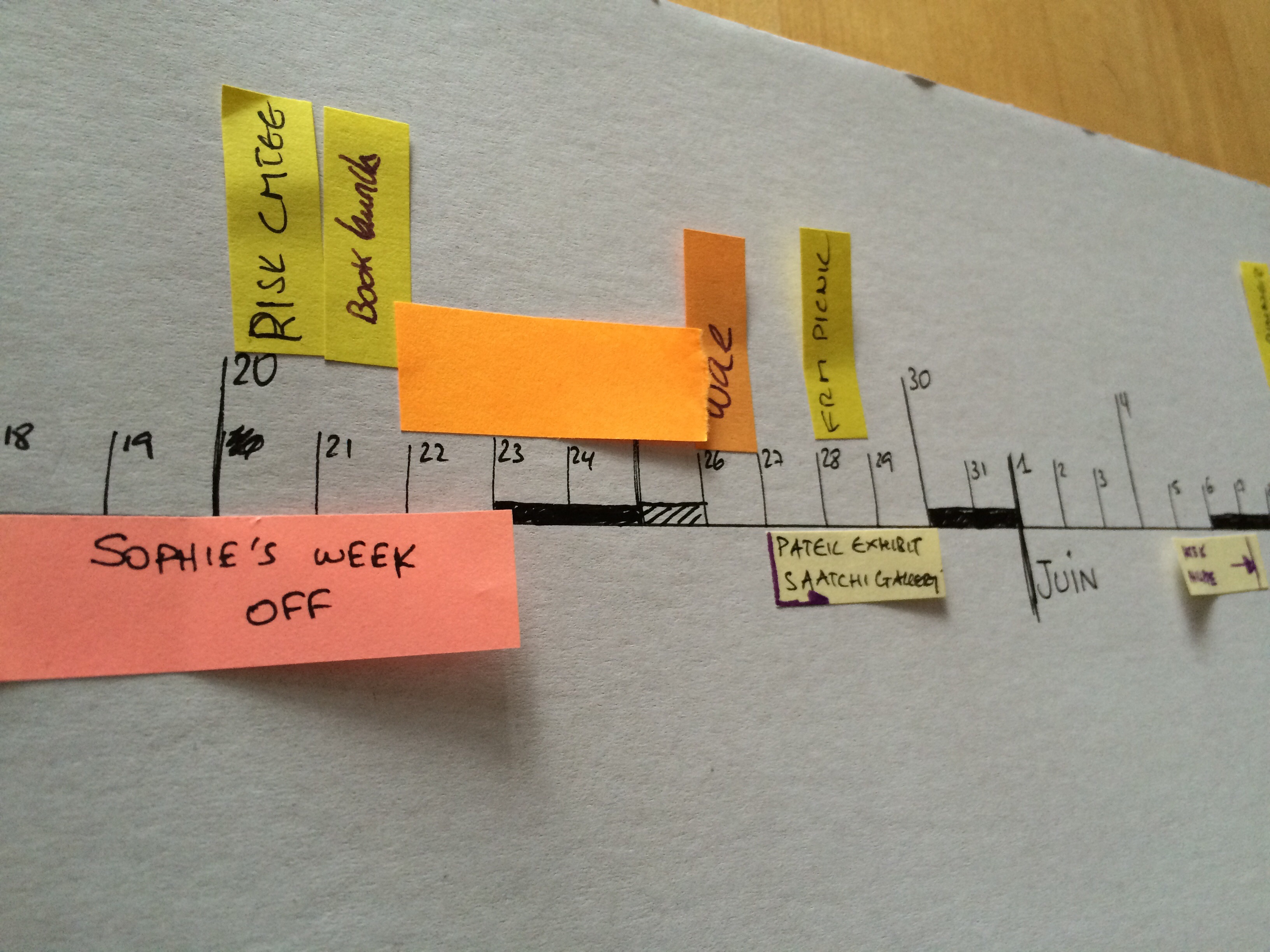
Time to read: 4 minutesDespite being an Engineer (or perhaps because of it) I am prone to reinventing the wheel. This is a post about how I reinvented the calendar, for the purposes of planning ahead, and doing it better. I am unsatisfied with calendars. Base 7 doesn’t come as naturally as base 10. And cutting things up in […] continue reading »
