I’ve just spent six weeks on a completely insane project.
The aspect I want to write about is how this insane project had no scope for (or understanding of) user testing, even though we needed to do some. And this article is about three “hacks” I devised to get some user feedback regardless of what others had planned.
Constraints
All we had was three 30-people 4-hour workshops with SMEs, where the consultants planned to show progress and get feedback. It was in those 30-people-in-a-room sessions that UX needed to get feedback too.
This is what we did with them, and what we got out of each.
Activity 1: pick & mix UI critique
By the day of the first workshop, we had only created one design for a demo. It was simple, built in a single day, without enough knowledge of the problem (it was my second day). Happily, the fantastic other UXer I was working with had been involved for MONTHS, and had a bit more context… as well as a dozen other versions that had been mocked up and waylaid over that time!
We were asked to show designs, but we both knew that if we showed them one design, we’d get things like “why is this blue” or “make the font bigger”. It’s the sort of feedback you get when you ask a human to look at a new interface.
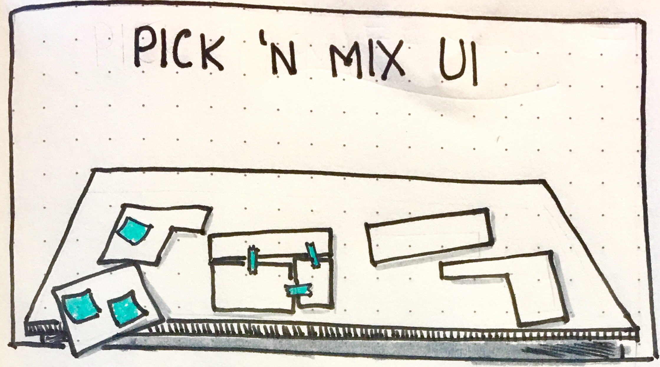
So we took another tack. We pulled our freshly hacked design, alongside three old designs, and devised a “pick & mix” session.
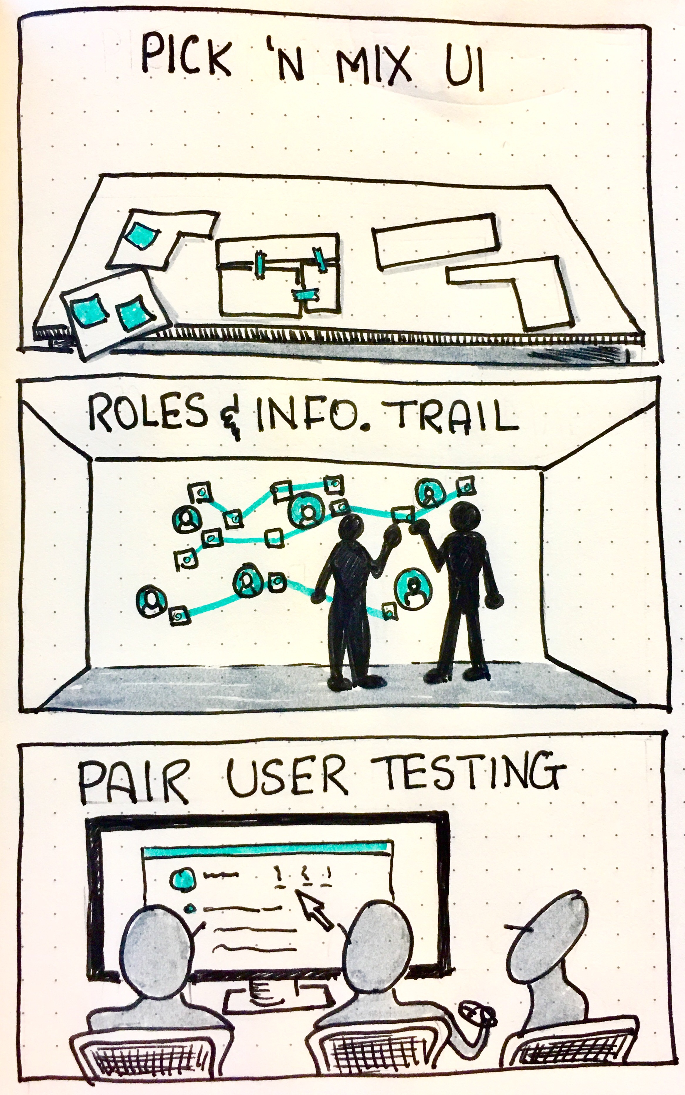
We gave groups of 3-4 SMEs pens, scissors, scotch tape and post its, and asked them to pick out elements form each UI that they found useful or gratuitous, effectively critiquing all four UIs, and build one that answered questions better for them.
What we got out of that session was that 2 of our 4 groups did the same thing: (main part of design A with sidebar from design D), which meant that 12 people agreed about where the value was. One more group chose design A as-is.
This made us very happy, because our new hack was actually design A… And 3/4 of our users found it had the best information of the ones they saw! Validation: achieved!
Preparation: 15 minutes.
Running time: 45 minutes.
Analyse results: 1 hour.
Activity 2: Information trail
By the time the second workshop came round (these had been pre-scheduled as part of the SOW and we could not alter anything), we had made some progress in understanding the perspectives of our users and their primary needs and goals. But we were struggling a little to understand the depth and breadth of their challenges (think use cases and journeys)
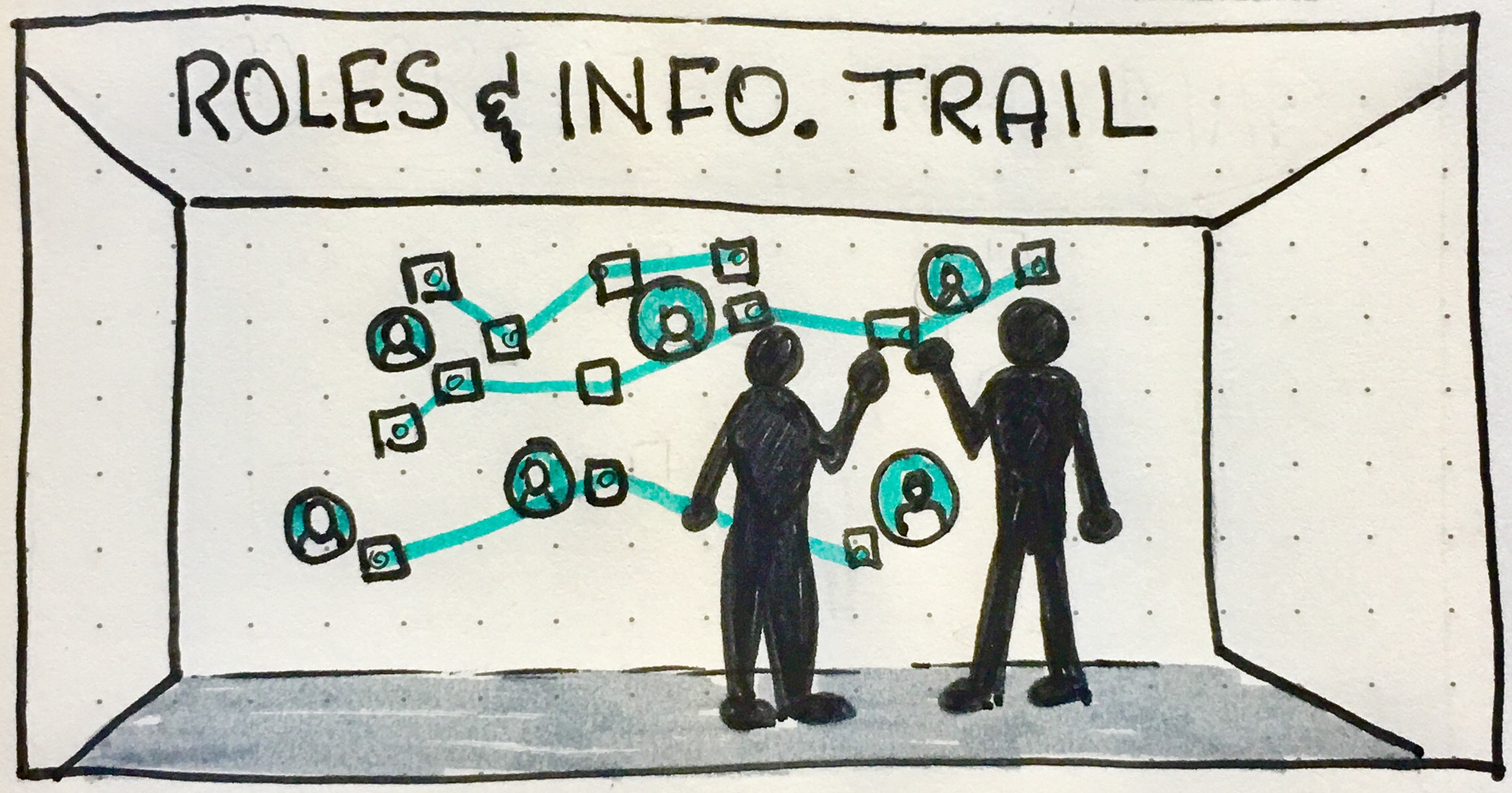
So we made them create a huge map of all information exchanged. We placed the personas belonging to our project on a big wall, and gave them cards, pens, pins and string. They created a huge web of information exchanged along the resolution journey of various kinds of problems.
From this, we got some of our more insightful and valuable user journeys. We also discovered that there were five more personas that we needed to add to our collection! (Just in case the project wasn’t complicated enough, right?)
Preparation: 2 hours (plus personas!!).
Running time: 1 hour.
Analyse results: 3 hours.
Activity 3: Pair user-testing
Part of the agreement with the client was to deliver a fully functional prototype of what we were aiming to build. What we’d made that far was plain images hooked up on InVision, so we thought that it was time to build something smarter. We used Axure to create something much more real-looking that they could explore.
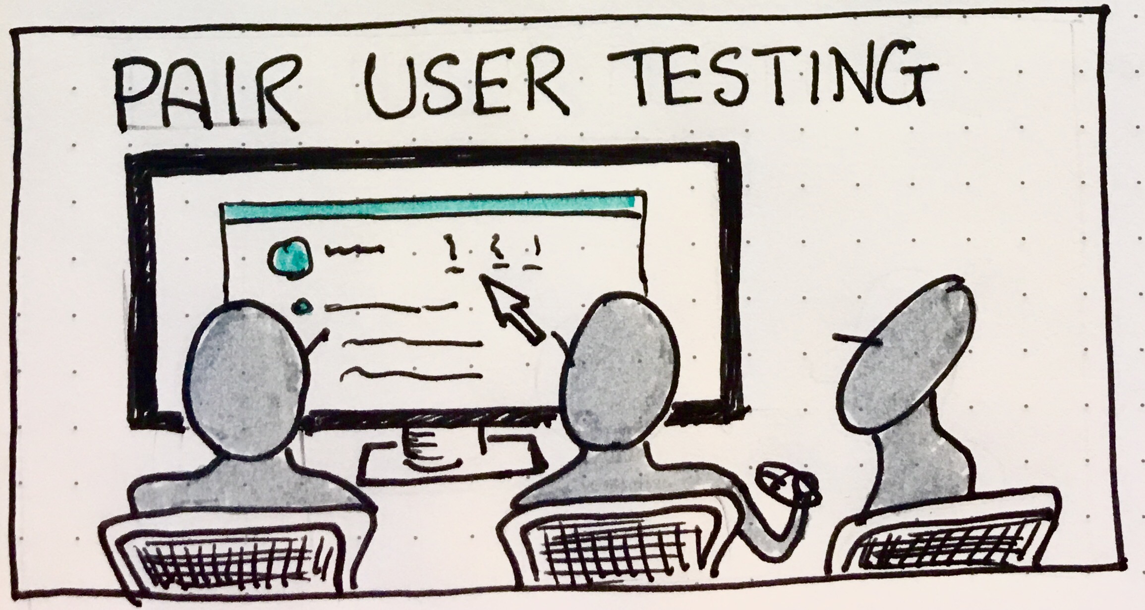
Our activity was traditional goal-oriented user testing: asking them a typical question / problem they deal with (our insights from activity 2 helped us here) and observe how/if they resolve it and what gets in the way.
THe difference between traditional user testing and our setup, is that we set them up two-by-two, with one moderator per pair. We were worried this would be awkward…
But our moderators told us they got fantastic feedback and conversations from their SMEs, because pairing them up made it easier for them to talk amongst each other! This should not have been a surprise: the talk-aloud protocol works better if you’re talking with / to someone who doesn’t feel like a knowledgeable observer, but a newbie puzzling things out like yourself.
From this activity, we got great feedback and a large tabulated view of all the points that they struggled against or made suggestions about. Which set us up for our final designs perfectly, as we knew precisely what problems to address and where to make the most improvements!
Preparation: 1 day (idea, worksheet for facilitators, brief facilitators) plus the prototype (6 man-days).
Running time: 1 hour.
Analyse results: 1 day.
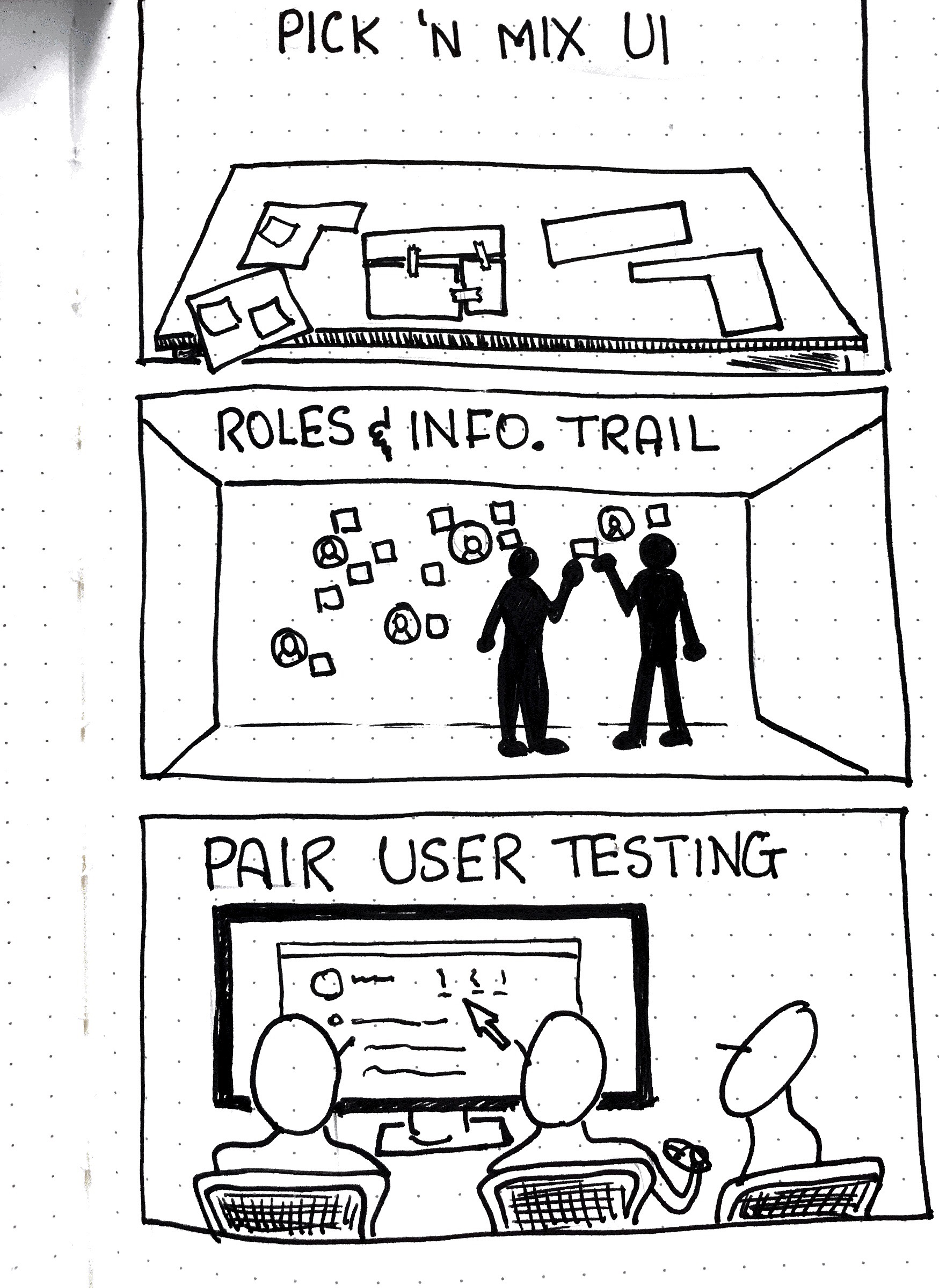
These are the three activities that got us through this project:
- Pick & mix UI critique
- Information trail
- Pair user testing
Hopefully nobody has to use them under such extreme circumstances… But they proved very helpful for us, and I decided to share them here.

