I was once tasked with improving the web experience of a large asset management company, who will remain nameless.
Spending enough time exploring the site, being curious and multilingual, I also poked around the various regional options when opening the site. That was when I noticed that every time you wanted to access a local site (say, Italy), you also had to choose a language… from the choice of one: italian. I tried a few other countries. Noticed a pattern.
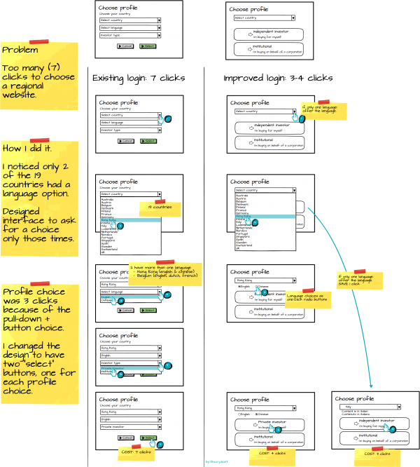
There were 19 countries, all of which required a language choice, but only 2 of which actually had a choice to offer. In 17 of the 19 locations, two clicks were completely gratuitous.
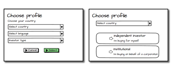
There was also a “user profile” choice, for regulatory reasons. Private investors and Institutions are shown different information (less details vs more details) about a fund. This was also done via a drop-down, and then the set was validated with “Select”.
I chose to streamline the final submission as well, replacing the 3 clicks of pull-down + button with 2 buttons that only needed one click.
An annotated wireframe of the “before” and “after” designs.
Epilogue: More than a year on, I notice they have not changed the design. But they have amended the language pull-down to at least automatically choose the one language available in those 17 cases.


